
a solopreneur's a-z guide on
How to Use Fonts Correctly
While the power of visual storytelling is magical we’ve got a long way to go before text is extinct. Which means you better learn how to use fonts correctly or you’re going to be staring down the barrel of obscurity. Right out the gate I need to clarify a common mistake. The correct term to use when describing lettering is ‘typeface’ not ‘font’.
TYPEFACE vs. FONT
Typeface is the actual character set. For instance, Arial, Times New Roman, or Century Gothic.
Font is the specific size and style of a typeface.
For example: Arial, is the typeface, Arial 10pt bold is the font.
Here’s the deal: Since this guide is for solopreneurs and non-designers I’m going to use ‘font’ and ‘typeface’ interchangeably…. BUT, now you know the difference so consider yourself edumcated. (yep, you read that right!)
THE ANATOMY OF A FONT
Now, you can’t wield fonts like a ninja until you understand how they work. So let me introduce you to the anatomy of a font.
There are six main structural parts of a font, which are each identified in the graphic below.

1. Point size is the total height of a font.
2. X-height is the distance between the top and bottom of a lowercase letter.
3. Baseline is the bottom of a lowercase letter.
4. Cap height is the distance between the top of the lowercase and the top of the uppercase.
5. Ascender is the portion of the uppercase that ascends from the cap height line to the top of the lowercase.
6. Descender is the portion of the lowercase that descends past the baseline.
THE FIVE TYPES OF FONTS
You may have heard these terms before but not actually understood what they meant so let’s run through the five main categories all typefaces fall into.

First up, are serif typefaces, which refer to the short lines at the ends of most of the letters (uppercase and lowercase) — those are called serifs.

Then, there are sans serifs typefaces, which are sans (meaning without) serifs.

Next, there are scripts which includes cursive, handwritten, and calligraphy typefaces.

The fourth category is decorative typefaces which come in all shapes and styles. These can be a whole lot of fun to look at but they have no place in a brand identity, other than on a rare occasion in a logo. Rare being the keyword.
I would say to you, steer clear of these for your brand and save them for your next party invitation.

And last but kinda least, in this case, are dingbats, which are symbol-based typefaces. It goes without saying, yet I still feel compelled to say it, this is another category you can forget about when it comes to your brand identity.
TRUETYPE VS. OPENTYPE FONTS
One last thing since we’re tackling new terminology, every typeface you download for your font theme will come in one of three formats: Truetype, Opentype, or Web Open Font Format.
The definitions for these are dry, tech shit that I can barely retain but here’s all you really need to know.
TrueType is the original format of text that was created by Apple and later licensed by Microsoft.
OpenType is the most recent font format that has been developed in tandem by Adobe and Microsoft.
And Web Open Font Format is a web friendly format, meaning a format that can be uploaded to a website. This one is not a format you can use in programs like Word, Pages, or even Adobe Illustrator or Adobe Photoshop.
CHOOSING YOUR FONT FORMAT
To determine the format of a font you can do one of two things depending on whether the font is already downloaded to your computer or not.
If you’re ever presented with both versions your best bet is to choose Opentype since that’s the most current format and it’s the one that’s compatible on both Mac and PC without requiring a conversion.

Now that you know the anatomy of a font and the different types of typefaces, here are seven techniques and best practices that’ll help you learn how to use fonts correctly in your designs.
TECHNIQUE no. 1
nailing your vibe
Selecting fonts is certainly not an exact science. Some may even argue it’s a bit subjective.
The best approach for font selection is to focus on matching the “feeling” of a font with the feeling you want to provoke in your font identity.
In the example below, I’ve chosen a font that conveys the feeling of the word along with one that conveys the opposite feeling.

When you’re choosing fonts for your brand identity use this comparison exercise to test out the compatibility of your choices with the desired atmosphere you’re trying to achieve. You’ll be amazed how instantaneously you’ll be able to spot a mismatch.
As you get more experience with fonts selecting them will feel less like a shot in the dark and more like a homerun.
TECHNIQUE no. 2
color matching
The basic rule of thumb for overlaying text on to photographs, images, and/or graphics is using light text on a dark background and dark text on a light background.
That is why every branding color palette needs to have a dark swatch and a light swatch that can be used specifically for text and backgrounds.
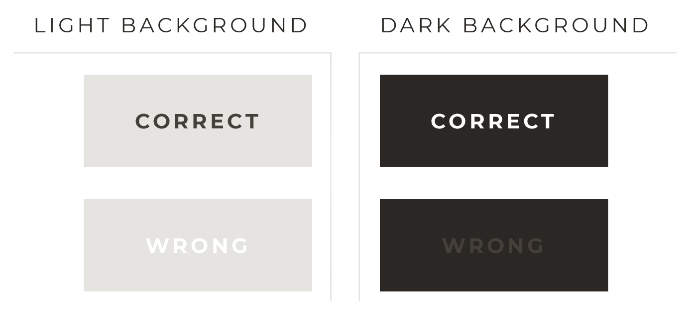
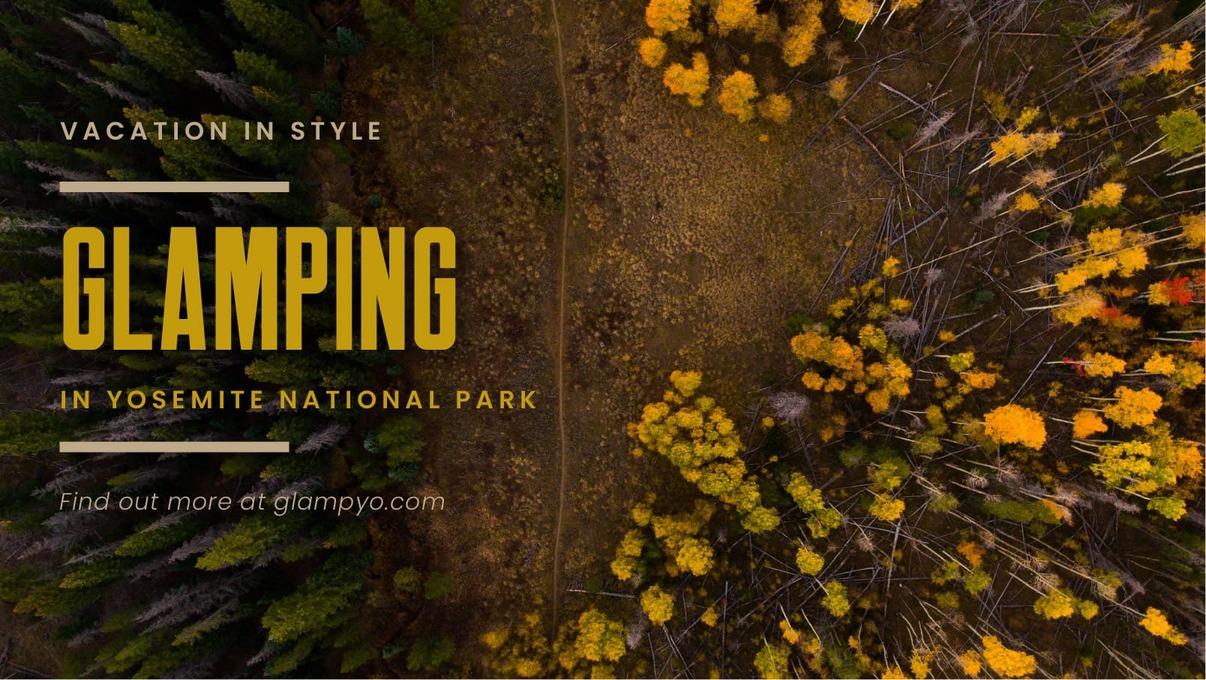
A great way to choose a color for your text is by pulling it directly off the photograph itself.
You can do this using the eyedropper tool that’s available in most design applications (including PowerPoint) or with Colorzilla, a Firefox and Chrome plugin that has a color picker tool you can use to pull the color off of anything on the web.
Pulling colors from the photograph you’re using is going to help you tie your text to the overall design, which will prevent it from looking haphazardly thrown over the photograph you're using.
Here’s an example of this color matching technique.

TECHNIQUE no. 3
using transparency
Another great way to make your text really legible when using a photography background is to reduce the transparency of the photo.
Here are two versions of the same image…

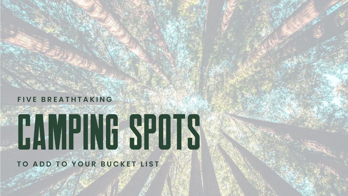
The first one has no transparency and the second one has 30% transparency which, as you can see, really makes the text pop.
This technique is great to use when you want the text front and center and the photograph as a secondary focal point.
TECHNIQUE no. 4
placement perfection
The best technique for placing text on your image is to create a box out of it. In other words, have the beginning and end of each line of text start and finish at the same points, which you can accomplish by playing with the text sizes and tracking (the spacing between letters.)
You can also use decorative elements (like a line) to extend the points on shorter strings of text that you don’t want to make larger or apply tracking to. See two examples below.


TECHNIQUE no. 5
same font, different story
A common misconception when it comes to how to use fonts is that you need to use a variety of them to create interest in your designs or you run the risk of everything looking boring. This couldn’t be further from the truth!
In fact, the easiest way to ensure your text isn’t too busy or distracting is to use one typeface for your entire font family.
Here are two different images, each using just one typeface. This is when terminology matters! There are several styles, a.k.a fonts, but only one typeface — Bodoni on one and Brandon Grotesque on the other.


The key to using ONE typeface is to use a font family and then play with different cases (uppercase, lowercase, sentence case, or title case), weights, sizes, and tracking for the different lines of text.
TECHNIQUE no. 6
font families
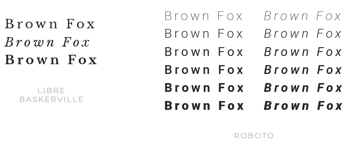
A font family is a typeface set that comes with a variety of styles.
When selecting a font family it’s important to keep in mind that the number of fonts vary in each family.
For example, the Roboto font family comes with twelve font versions whereas the Libre Baskerville font family only has three. While size doesn’t make any font family more superior than another, it will provide more built-in options.
TECHNIQUE no. 7
kerning
Kerning refers to the spacing between words. Each typeface comes with its own default kerning.
Meaning, each typeface's spacing is controlled by the designer who created it. Kerning can be manipulated with certain applications, like Illustrator, InDesign, Photoshop, and PowerPoint.
Below I’ve used two different serif fonts both at 60pts.

As you can see the Libre Baskerville line of text is much longer than the Roboto line, which is because of the different default kerning.
Below I’ve used Libre Baskerville on the first letter and Roboto on the second, each at a size of 120px.

As you can see the point size (the distance from the top of the letter to the bottom) is also different for these two fonts, again because of the default properties of each.
While you can always adjust the kerning, pay attention to kerning and the overall default properties when you’re making the selections for your font theme.
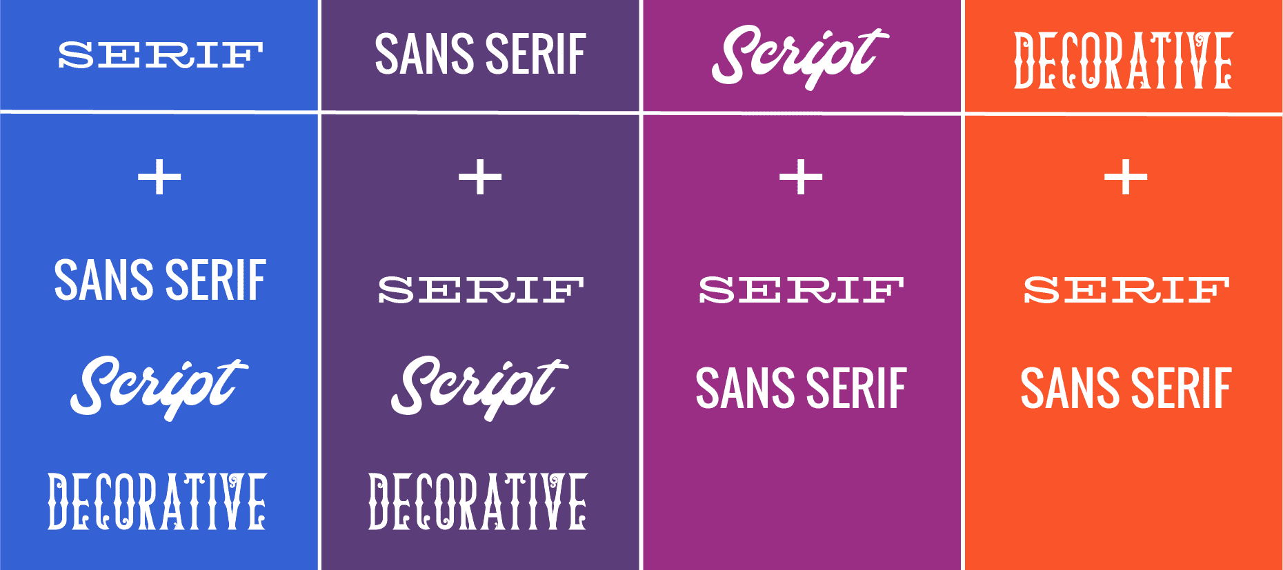
Both serif and sans serif fonts can be paired with any type of font, whereas script and decorative fonts can ONLY be paired with a serif or sans serif font.
Use these guidelines when building out the font theme for your brand identity because it’s really that straightforward!
ONE MORE THING
BEFORE YOU GO
I know that learning how to use fonts is important to you so don't forget to pin this post to at least one of your go-to Pinterest boards and bookmark it in your browser so you have easy access to these typography knowledge bombs when you need them.
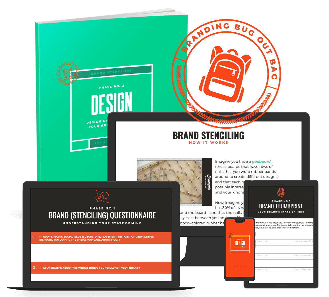
If you’re equally interested in creating an entire brand identity that you’re lovestruck over snatch your Branding Bug Out Bag. In it, I outline my entire psychology-backed approach to design, called Identity Stenciling, which is a three-phase process for identifying where your brand’s state of mind intersects with your buyer’s belief system and developing those intersections into your brand identity assets.
say hello to your
BRANDING bug out bag
Your very own branding survival kit, fully stocked with everything you need to create a handcrafted brand identity that's as original as a fingerprint and addictive as a two for one happy hour, so you have peace of mind knowing that the only buzz you're creating is the kind that's contagious.