3-PART BRAND COLOR SERIES
HOW TO CREATE A FOOLPROOF BRANDING COLOR PALETTE
In this 3-part series you're going to learn everything you need to know to create a branding color palette that'll never (EVAH!) fail you.
How can I be so sure? And I am sure! Because, on top of all the knowledge bombs I'm dropping, I've also got an Adobe Illustrator Brand Fitting Room you can snatch up so you can test-drive your color palette ( and every other one of your brand assets) to make sure all your brand colors play well together before you "put a ring on it". Scroll to the bottom of this page to snatch that bad boy up!
Let's paint the world with your brand-colored love language, shall we? If you're coming back to this series for a refresher I've made it easy to find what you're looking for.
Click one of the colored icons below to skip to a specific installment in this 3-part series.
written by: dre beltrami
reading time: 20 minutes
Part one
THE 5 TYPES OF
branding COLOR PALETTES
THAT REIGN SUPREME
I hate to burst your color loving bubble (it really is such a cozy bubble) but not all color palettes are created equal when it comes to branding.
Creating a kickass branding color palette for your brand isn’t just a matter of personal taste or favorite colors. That’s what your bedspread and throw pillows are for.
Your brand identity should be made up of digital assets that WORK, not just pretty shit that makes you gush, and your color palette is no exception!
As we go through the palettes, I’m going to take you for a spin around the color wheel and play a little Love Connection because colors have relationships. Not the Netflix and chill kind... but you already knew that.
Like any relationship, on paper your branding color palette might look like a match made in heaven (don’t they all at the beginning) when it’s really more like a May to December romance.
I want happily ever after for you and your color palette, so let’s hit the wheel.
HERE IS THE TYPICAL 12 SPOKE COLOR WHEEL.
This is the same color wheel that graphic designers, interior designers, and fashion designers use. It’s THE authority on color relationships no matter where you’re using color.

With this image front and center to refer back to, let’s dive in!
In no particular order, here are the 5 types of branding color palettes that reign supreme (like the kings and queens they are), along with real-world examples of each.
branding color palette no. 1
monochromatic
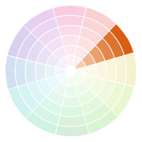
A monochromatic branding color palette is shades (darker) or tints (lighter) of ONE color on the color wheel.
Monochromatic palettes are one of the most popular color palettes used in branding but that doesn’t mean you’re destined to look like everyone else.
In terms of our Love Connection analogy think of this palette as the kissing cousins in the world of color.
Here are three real world brand examples of this ‘one color’ palette.
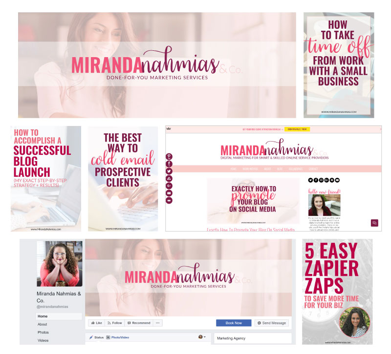
MIRANDA NAHMIAS
Miranda keeps it simple by using different tints and shades of pink for her branding color palette, which creates a beautiful contrast in her visuals.
Using a monochromatic palette like this makes stacking your elements slightly easier than some of the other palettes because of how closely related the colors are to each other.
Miranda uses her tints (the lighter colors) for her backgrounds and overlays and her shades (the darker colors) for her typography, which makes her text really pop while still maintaining a softness.
JESS CREATIVES
Jess uses a monochromatic branding color palette as well, but she uses her colors a little differently.
She predominantly uses her main color with white for a clean and minimal look, and saves her other tints and shades to create gradient overlays to soften things up a bit.
PEG FITZPATRICK
Peg has an awe-maazing (a very technical term you’ll have to go to design school to learn about) “pretty in pink” monochromatic branding color palette that’s drenched in feminine energy. Even the photography she uses honors her palette, which makes for one solid gold brand identity.
As you can see, just because a monochromatic branding color palette is built around ONE base color it doesn’t mean you’ll lose any versatility or contrast. It’s all about using the tints and shades to play up each color, which comes down to having a defined role in your palette ‘family’. We'll tackle more about that in the second installment in this series.
branding color palette no. 2
COMPLEMENTARY
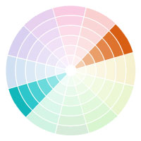
A complementary branding color palette features colors directly across from one another on the color wheel.
This type of palette is one of the most recognizable because of the organic complementary qualities of the two colors.
You can use the base colors, like purple and green, or you can use tints and shades of those two colors.
In terms of our Love Connection analogy think of a complementary color palette as a case of opposites attract. The ying to your yang, if you will. One is warm, one is cool, and together the two ‘opposites’ bring out the best of each other.
Here are two real world brand examples of complementary branding color palettes.
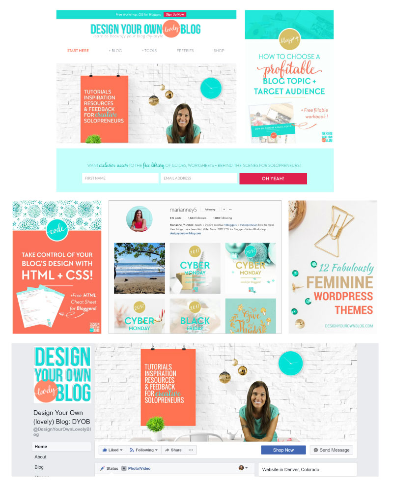
DESIGN YOUR OWN BLOG
Marianne at Design Your Own Blog uses an aqua and apricot pairing for her complementary branding color palette, along with some tints and shades of each of those colors.
Understand this, while a complementary palette will include colors across from each other on the color wheel, that doesn’t mean you can ONLY use the base colors on the wheel.
Think of tints and shades as the offspring of the base colors on the wheel. As long as the parent is the same, the generation doesn’t matter. Meaning, so long as you’re using tints and shades of a complementary pairing (in this case teal and orange), that is STILL a complementary branding color palette.
branding color palette no. 3
ANALOGOUS
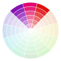
An analogous branding color palette features colors that are next to each other on the color wheel.
Analogous color palettes are one of the most versatile color palettes for branding because the palette as a whole will usually share either all “warmer” qualities (like orange, red, and yellow) or “cooler” qualities (like purple, blue, and green).
Because of this harmony and built in flexibility creating a unique analogous branding color palette lends itself to an incredibly recognizable look, assuming you keep things consistent across your content.
As far as our Love Connection analogy goes think of analogous color palettes as more lifelong friends than a love affair. They’re familiar, closely related, and never far from the other. But hey, maybe one drunken night they hook up. Sometimes best friends turn into love connections…who are we to judge?
Here are three real world examples of an analogous branding color palette.
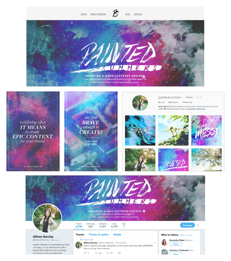
PAINTED SUMMERS
Allison over at Painted Summers uses an analogous color palette on the cooler side. You can see she’s got blue, green, purple, and even some magenta. Everything that’s hanging out on the top left side of the color wheel.
Notice how, even though there’s an abundance of color in her brand identity, it doesn’t feel distracting or haphazard.
That’s the nature of sticking to colors so close to one another on the wheel – they gel like a pack of besties.NATHALIE LUSSIER
Nathalie also uses an analogous branding color palette that’s on the cooler side, yet her identity has a very different feel than Allison’s.
<rant>
Knowing the different types of branding color palettes is important for understanding how colors relate to one another but (with a capital B!) how you use your palette will ultimately dictate the style of your entire brand identity and how instantly recognizable it is.
Remember, color is just the beginning when it comes to creating a visual world that’s in a league of its own.
</rant>
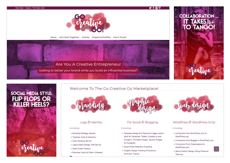
GO CREATIVE GO
Here’s one last example of an analogous branding color palette from Mallie over at Go Creative Go. Her palette straddles the warm and cool on the color wheel, which is another viable approach.
An analogous color palette doesn’t have to fall into the all warm or all cold bucket I mentioned earlier, it can always marry the best of both of those worlds, just like Mallie has done.
branding color palette no. 4
TRIAD
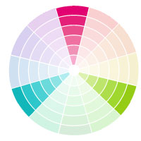
A triad branding color palette feature three colors that are equidistant from one another on the color wheel.
This tends to be the toughest color palette for branding because it can become busy… quickly!
The key to success on this one is to keep one color more dominant in your brand identity and use the others as accent colors.
As far as our Love Connection analogy goes I would file this one under ‘open relationship’. The colors work well together but there’s usually a dominant one and a couple of ‘substitutes’ to spice things up when the urge arises.
Just like a real-life relationship, this open relationship isn’t for everyone. You have to be willing to work out the kinks and make sure everyone (or in this case every color) is getting what it needs. It’s more important than ever when it comes to a triad branding color palette that you define how you will use each color. Those who don’t, end up failing fast!
Here are two real world brand examples of a triad branding color palette.
FREEDOM HACKERS
Kimra over at Freedom Hackers has one of the most unique brand identities I’ve seen out there, and it features a triad branding color palette.
She has a dominant color, which is her dark navy, and then uses the other colors in her palette as accents on her decorative elements and typography.
Notice how doing that allows her to control where your eye goes in her content and designs?
A triad palette can accomplish this better than any other type of branding color palette IF you do it right, and Kimra has, there’s no doubt about that!
HUB+COMPANY
Here’s another triad branding color palette from Andrea Hubbert (this is her previous brand Hub+company).
She’s got a dominant color, which is her purple, then she uses the other colors in her palette as accents, in her case as backgrounds.
The purple anchors everything and that’s what you want from the dominant color in a triad branding color palette.
branding color palette no. 5
NEUTRAL WITH A POP OF COLOR
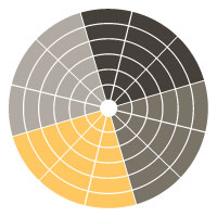
Neutral with a pop of color is a branding color palette that features all neutral colors with ONE color that pops off the rest. That pop of color can be bright and brilliant or more subtle in nature.
These types of color palettes have become really popular in the few years and for damn good reason.
The largely neutral elements create a clean backdrop for the real star, the POP of color, which is exactly how to make a specific swatch in your palette an iconic piece of your brand identity as a whole.
As far as our Love Connection analogy goes think of this color palette like the dynamic of a room or table full of family and/or friends. There’s almost always that one really big personality. Maybe they're loud and boisterous, maybe they're a social butterfly fluttering all over, or maybe they just have no filter. You know the one. We all have them in our lives. Or maybe you are the big personality. Guilty as charged for me!
This type of branding color palette functions in the same way as the dynamic of that table. No one part (or person) is greater than the others. It’s the palette (or table) as a whole that completes the experience.
Here are three real world brand examples of the neutral with a pop of color branding color palette.
PERSUASION REVOLUTION
Bushra, from Persuasion Revolution, is one of those BIG personalities we just talked about so it’s not a surprise that she chose a neutral with the pop of color for her branding color palette.
She is what some might call a “firecracker” but I just call her one cool bitch (and yes that’s said oozing with love). There’s definitely some kindred vibes between her and I which is evident when you look at the similarities in our personalities and our color palettes (in terms of my previous brand The Branded Solopreneur).
She’s got a neutral backdrop of black and white paired with her orange pop of color. On occasion, Bushra will also swap out a different pop of color, usually red, purple, or blue, depending on the type of content she’s creating, which is a great color assignment strategy.
Assigning a specific pop of color for a specific type of content, let’s say your podcast, can be a great way to communicate you’ve just released a new episode (or mini course, or video tutorial, you get the picture) in your visuals without having to spell it out. More on that in the second installment in this series.
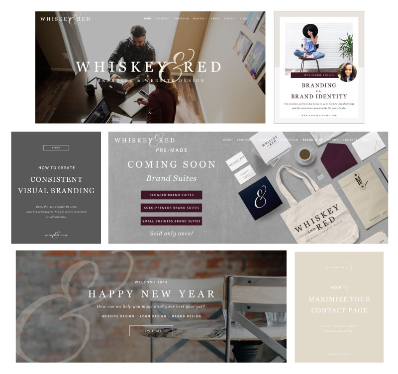
WHISKEY AND RED
Julie and Steven over at Whiskey and Red also use a neutral palette with a pop of color, but they’ve taken a very different approach than the other examples I’ve shown you. They chose a neutral backdrop of creams and grays with a deep wine as their pop of color.
Don’t let the ‘neutral’ in the name of this branding color palette lead you to believe that you have to use black and white OR that your pop of color has to be bright and in your face. Your palette can be made up of pastels if that’s your choosing. It’s more about the dynamic of having a neutral canvas with a pop of color.
READY TO OWN YOUR brand COLORS? 🥳
I just dropped a new brand styling series that has a brand color lesson that's LOADED with trade secrets that are going to help you source out, settle on, and style-proof each and every color in your branding palette to make sure it passes the “suckage test” so you can rest easy knowing your color palette is so synonymous with YOU that the moment people see it they immediately think of you.
HOW TO CULTIVATE
BRAND RECOGNITION
WITH A STYLE SO Original IT'S INSTANTLY RECOGNIZABLE
An entire library of brand styling ideas outlined with examples + spiked with "Does yours suck?" sanity checks along the way.
Part TWO
THE DNA MAKEUP OF A BRANDING COLOR PALETTE
While the look and feel of your branding color palette is going to be dictated by your brand essence, personality, and industry the genetic makeup of it will NOT be unique to you or your brand.
At least it shouldn’t be!
Don’t worry though my lil' unicorn, that doesn’t mean you have to bleed the same rainbow as anyone else, it just means that there’s a genetic structure you want to preserve to ensure your branding color palette has healthy genes.
In the first installment of this series, I showed you the five types of branding color palettes that reign supreme and how each of them works. In this second installment, I’m going to dissect the DNA of a branding color palette so you understand exactly what versatility you need to build into yours.
A branding color palette can be divided into four sections, each one fulfilling a very specific purpose, so let’s run through those in the order you should define them.
As we go through each section I’m going to give you an example courtesy of my client The Over 50 Roadmap so you can see a real world branding color palette in action. At the end of this installment, I’ll show you a side-by-side of their entire palette and their website homepage so you can see it all at a glance.
branding color palette section no. 1
Website Backgrounds and Text Colors

Let’s get the least visionary section out of the way first because I know your unicorn veins run thick with creativity and this category is not where you need to use much of that.
The first two colors you need to define for your branding color palette are for backgrounds and text on your website and throughout your content. These colors should be as far on the intensity scale of color (which I show you in the 3rd installment of this series) as you can get away with. Meaning, as close to black and white as will fit in the brand identity suite you’re creating.
Readability is of the utmost importance here which is why I want you to keep it basic on these two “colors” (you’ll understand the quotes in just a minute).

Let me make these two a no-brainer for you.
YOUR OPTIONS FOR THE DARK COLOR ARE:
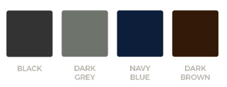
Choose whichever option blends best with the branding color palette you’ve chosen and the overall style of your brand identity suite.
YOUR OPTIONS FOR THE LIGHT COLOR ARE:
Yep, that’s it, just white.
Unless you want to time-travel back to the early 2000’s when colored backgrounds on websites were all the rage, I highly recommend you stick to white. White won’t wash out the rest of your unicorn fabulous color palette (in case that’s what you were thinking), it’s simply priming your branding color palette for maximum usability by creating a nice clean canvas to work with.
brand color palette section no. 2
Iconic Brand Color
The next color you’ll need for your branding color palette is an iconic color which is the color that will be most widely associated with your brand. In other words, when people see this color they know you’re behind the content without ever having to read a word. THAT’S brand recognition, baby!
This color will be the dominant color used across your visuals; including your logo, your social feeds, and your website, so this color has to capture the essence of your brand belief system.
If you’ve chosen a triad branding color palette (which is one of the five types of color palettes I showed you in the first installment of this series) this will be the main color we talked about, so you’ll want to build your palette around this color.
Regardless of what type of color palette you choose make sure you’re sticking to the specific relationships that exist on the color wheel. Those relationships are what makes these branding color palettes reign supreme, so it’d be pretty boneheaded to mess with perfection.branding color palette section no. 3
Action Color

Next up, you’re going to need an action color which will be used for your buttons, links, and calls to actions.
By reserving this color for these action elements only you’ll increase the potency of those elements. In other words, that shit will be POPPIN’ like ‘look at me!’ without you having to scream it. Quickly, your readers’ eyeballs will be primed for that color. Their eyes will naturally be drawn to it like a moth to a flame, which is the first step in getting them to take action, right?
First, they have to see the button (link, CTA, etc.), then they can click that sumabitch!

When it comes to your action color, make sure it pairs smashingly (another very technical term) well with your iconic color because more often than not these will be the two colors paired together most frequently in your designs and content.
branding color palette section no. 4
Accent Colors

The last section of your branding color palette is reserved for your accent colors (which can range from 1-3 swatches depending on your preference). These are the colors you’ll use to interrupt your dominate + action color pairing when you want to accentuate or highlight something special.
There are endless ways to use your accent colors but here are just two of my favorites…
ASSIGN your accent colors TO SPECIFIC CONTENT
Assign each of your accent colors to a specific type of content, topic, or product. For example, all of your podcast episodes use one accent color and all of your written posts use another.
Color coding like this will help your audience spot new content that hits the spot when they’re cruising around the web. If they love your podcast and they know those visuals are always red, when they see that red pop up in their feed they’re going to be much more likely to pause their scrolling to get their click on.
This is also great for creating super clear content paths on your website. Kinda like follow the yellow brick road, only with the color of your choosing.
Here's an example from Bushra from Persuasion Revolution, who I mentioned in the first installment of this series.

USE your accent colors IN YOUR FEATURED IMAGES
Accent colors are also great for creating a signature background for your featured images.
You can create a tricolor gradient overlay or alternate your accent colors as a solid background in your images.
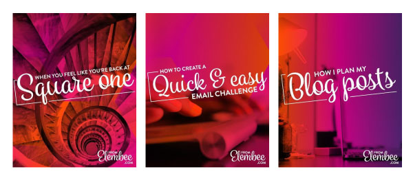
BONUS: The latter will save you a fuckton of time scouring the internt for that perfect stock photo too… and who wouldn’t mind more time being put back into their day? That alone is reason enough to consider trying the approach!
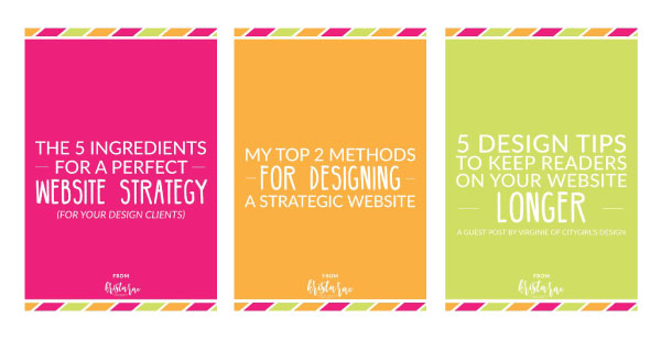
However you choose to use the accent colors in your branding color palette make sure that they fit into the scheme of the palette you’ve chosen. That means, if you’ve chosen a monochromatic color palette (which is another type of palette I showed you in the first installment of this series) then your accent colors will be tints and shades of your chosen base color.
THE OVER 50 ROADMAP
FINAL BRAND COLOR PALETTE + WEBSITE HOMEPAGE

NEXT steps
If you stick to this DNA profile you’ll end up with a branding color palette made up of 5-7 colors, which you'll actually know how and when to use!
Now that we’ve explored the five types of branding color palettes you can choose from and broken down the DNA makeup you want to model yours after, there's only one thing left to do. Create your color palette!
In the 3rd and final installment in this series I’m sharing four idiot-proof ways you can create your color palette from scratch in under an hour (even if you've tried and failed countless times before).
HOW TO CULTIVATE
BRAND RECOGNITION
WITH A STYLE SO Original IT'S INSTANTLY RECOGNIZABLE
An entire library of brand styling ideas outlined with examples + spiked with "Does yours suck?" sanity checks along the way.
Part three
4 SCARY EASY WAYS TO SOURCE OUT THE COLORS FOR YOUR BRANDING COLOR PALETTE
It’s not as easy to create a branding color palette as it may seem. Most solopreneurs simply pick a bunch of colors they love and call it a day. Those are the same solopreneurs that end up changing their color palette 42 times.
Let’s skip that giant suckage of time and make sure you have all the knowledge bombs you need to put together a branding color palette that will NEVER fail you, the first time around.
In part one of this color series, we covered the 5 types of branding color palettes that reign supreme and how each one works and in part two I broke down the entire DNA of a branding color palette, including how many colors you need and exactly how to use each color in your palette. Make sure you circle back and give both of them a thorough devouring so there are no gaps in your understanding of color and how to rock that shit in your brand identity.
In this last installment in the series we’re going to tackle three, actually FOUR since I threw in a bonus for ya (insert giddy squeal), ways to create a color palette that’s totally failproof.
But before I show you those, let’s run through how to define a color and the differences between online and print colors so you know exactly what to look for when you’re choosing the colors for your palette.
How To Define A Color
Ask five different people to choose a blue paint swatch and I guarantee you’ll end up with five very different shades (or tints) of blue. Even if you got more specific and asked them to choose a sky blue swatch, you’d still end up with five different shades. It’s the nature of color and how differently we perceive it. That’s why there are ways to define specific colors. These definitions take the guesswork out and keep everything consistent!
There are four methods for defining a specific color in your branding color palette. There are two definitions that are used for web-based projects and two definitions that are used for print-based projects.
The reason for having a variety of ways to define every color in your palette is so you can achieve the same color regardless of the medium. Web browsers display colors differently than a print machine produces colors, so you need these different definitions to fit these different modalities.
With that said, make sure you have at least one web definition and both print definitions for each color in your branding color palette. That way you’ll always have all your color bases covered.
METHOD 1: A HEXADECIMAL CODE
A hexidecimal code (or hex code as it’s also called) is a 6-digit alphanumeric that’s preceded by the ‘#’ sign, which is used to define web-based colors.
The first two numbers describe the red additive of a color (meaning, the intensity of red present in that color), the second pair describes the green, and the third pair of numbers describes the blue additive.
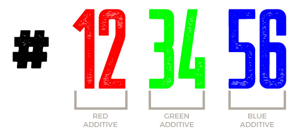
Basically, it defines how much of each of the three primary colors you need to create the exact color you want. For instance, if you want a true red, the hex code would be #ff0000, if you want a true green it would be #00ff00, and if you want a true blue it would be #0000ff.
Every web color has its own unique hex code which is the easiest method for defining web-based colors.
METHOD 2: RGB
RGB stands for the primary colors (red, green, and blue), the same colors we just talked about with hex codes.
Just like the hex code, the RGB color system creates web-based colors by combining the primary colors in varying degrees.
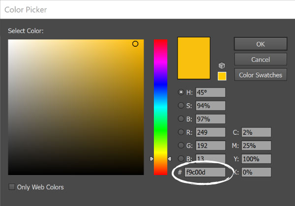
In RGB definitions, each letter is represented with a number between 0 and 255, which represents the intensity of that specific color (0 being the lowest intensity and 255 being the highest intensity). Meaning, a true red would be 255, 0, 0, a true green would be 0, 255, 0 and a true blue would be 0, 0, 255.
When all three of the colors are displayed at their full intensity (255), the result is pure white, when all three colors are combined at the lowest intensity (0), the result is pure black.
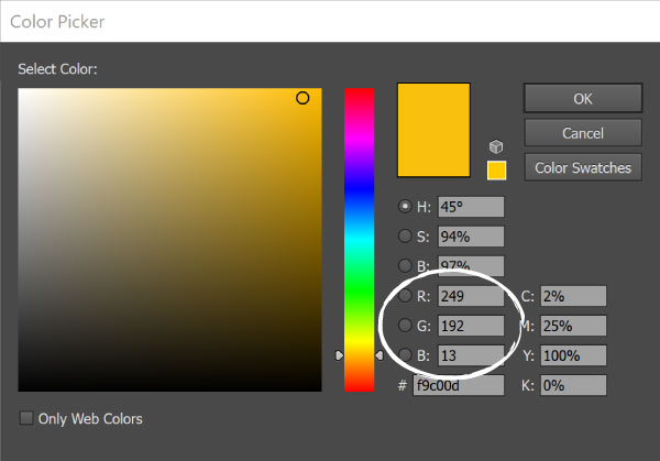
If you look at the screenshot below, you’ll see the RGB parameters circled, and right below that, you’ll see the hex code for the yellow displayed. Both of these definitions will net you the same web-based color, so choose whichever system you prefer and make sure you have the definitions for all the colors in your branding color palette.
METHOD 3: CMYK
Now let’s talk about defining your colors for print-based projects, like business cards, stationary, or even swag.
The first method is the CMYK system, which stands for cyan, magenta, yellow, and black, which are the primary ink colors used in print. Each letter is represented by a percentage that specifies how much of a particular ink should be added to create the specific color you want.
In the screenshot below you’ll see the CMYK parameters for the yellow we’ve been working with, along with the web definitions we’ve already talked about.
Make sure that you have the CMYK values for each of the colors in your branding palette as those are the definitions you’ll need to give to your printer.

METHOD 4: PMS
While the CMYK system is made for print-based projects it can still yield a lot of variation in the final color that is produced because of discrepancies in the ink used by different printers. In other words, you’re not guaranteed to get the same final color from one printer as you will from another, even if they are printing the same project.
The best way to ensure you’re getting the same colors in your print projects (even years down the road, no matter what printer you go to) is to define and use a PMS definition for each color in your branding color palette.
PMS stands for Pantone Matching System and it’s a proprietary system that was created to standardize print colors across industries, printers, and locations, so print color is never left to chance.
Unlike the previous three color-defining methods, PMS colors are not represented by additive percentages or intensities, though those parameters are used to find the PMS equivalent of a hex code, RGB, or CMYK definition.
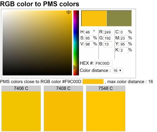
To find the PMS equivalents for the colors in your palette, you can use a color converter like this one which allows you to enter any of the other three color definitions mentioned to find the PMS equivalent.
Now that we have color definitions out of the way, let’s get to the fun stuff! Here are four ways to create a color palette that will NEVER, and I mean never EVAH, fail you.
BRANDING COLOR PALETTE tool no. 1
COLOURLOVERS
COLOURLovers is a community where color enthusiasts create and share colors, color palettes, and patterns. At the time of writing this, there are a mind-blowing 4,773,121 color palettes to inspire you. So trust me, there’s no shortage of color palettes to drool over!
Whether you’ve got absolutely no clue what colors you want to use, you just need some help finding the perfect shade or tint of a specific color, or you’re somewhere in between, there are endless ways you can find what you’re looking for on COLOURlovers.
Once you land on their homepage, click ‘Browse Palettes,’ which is in the menu on the far top left corner. That’ll open their palette search page. From there, click the black ‘Search’ button, which will open a new box loaded with a variety of search filters.
There are three ways you can use COLOURLovers search filters to find the colors for your branding color palette.

KEYWORDS
Use descriptive words that describe your brand or represent characteristics of it. For instance, if I was building a holistic coaching brand I might search for keywords like zen, soothing, or meditation.
This’ll give you a great starting off point if you’re looking for creative direction for your color palette.
SPECIFIC HEX CODE
If you already have a specific color you know you want to use, you can enter the hex code in their search filter and browse all the palettes they’ve got with that specific color in it.
This is a great way to get some inspiration for your branding palette when you have a starting point but you’re lost on how to round out your color scheme.
Pair what you have learned about color relationships in the first installment of this series with the inspiration on COLOURlovers and you’re going to have a failproof branding color palette in no time.
GENERIC COLORS:
If you know the general colors you want in your palette, you can use their ‘Hue’ filter to choose up to three different base colors. For instance, if I continue with the holistic brand from before, I might search palettes that feature blues and greens.
Once you select the base colors you want you’ll be able to browse all the color palettes they’ve got with all of those colors in it.
BRANDING COLOR PALETTE tool no. 2
ADOBE COLOR CC
Adobe Color CC is a fully loaded color finder and color palette creator that has tons of features.
When you land on their homepage, you'll find a color wheel with each of the palettes we talked about in the first installment of this color palette series listed to the left (see screenshot below).
Once you select the type of branding color palette you want to create, it will manipulate the color wheel so that only color combinations that fit into that scheme are created. You can then drag the points to different areas of the color wheel while it maintains the palette type you’ve chosen.
As you drag the points around the color wheel the colors will update in the five swatches below the wheel. When you find a color you want, you can click on that square and grab the RGB and hex code for that specific color.
You can even slide the controls for each of the additives (red, green, and blue) on any specific color to get the shade or tint just right.
Can you say COOL AF?! And this is just the beginning of what you can do with Adobe Color CC.

USING A PHOTOGRAPH
My favorite feature, by far, is the ability to create a branding color palette from a photograph.
Often times you can find a photograph that, while unrelated to your brand, really captures the essence of your brand or maybe just the essence of the style you’re going for, but how do you take that photograph and build from it?
You turn that photograph into your branding color palette, that’s how!
Here’s how to do that…
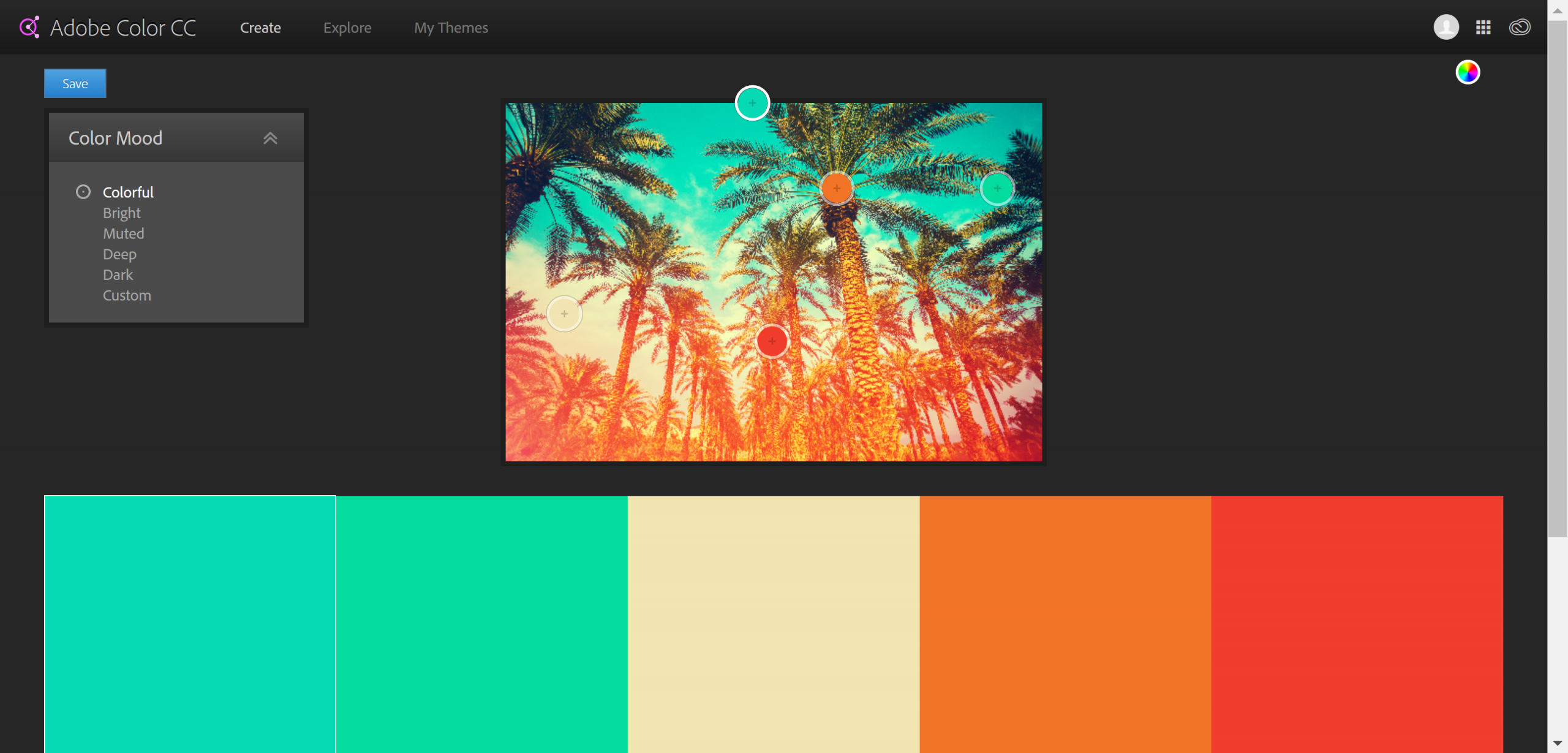
Upload your photograph to Adobe Color CC using the camera icon in the top right corner. Once that’s uploaded you’ll see your photograph on the screen with five color palette swatches below it. You’ll also see a box on the left side that has six prompts: colorful, bright, muted, deep, dark, and custom. When you click on one of those prompts it will update the swatches based on your selection.
Then, you can click on any of the swatches and drag that point (which is represented by a circle in the color of that swatch, with a plus sign in it) in the photo to update the color of that specific swatch.
When you get a full color palette or a single color that you want to use, you can click the color wheel icon (which is in the same place the camera icon was in) to get back to the color wheel screen where you can grab the RGB and hex codes for those swatches.
It’s really skies the limit here! This tool can turn a little productive play time into a failproof branding color palette faster than you’ll ever be able to do in your head.
branding color palette tool no. 3
COLORZILLA
Colorzilla is a Firefox and Chrome browser extension that’ll help you swipe the specific hex codes and/or RGB values from anywhere on the web, including whole webpages.
That means, no more seeing an image with that perfect shade and having to wonder what the color is.
The Colorzilla extension comes with a couple of cool features for color swiping so let me show you how it works.
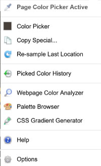
Once you load the extension in your browser, you’ll have a color picker icon available on your browser bar. When you click that icon it’ll open the menu you see below.
If you choose the ‘Page Color Picker’ option, a black bar will appear at the top of your screen, like the one you see in the screenshot below.
You can then hover the crossbar that appears over the color you want to swipe. Once you click on what you want, the color will be saved to your clipboard and to the extension, and the black bar will disappear.

Then, you can either paste the hex code that’s saved to your clipboard to a document or you can click the color picker icon and choose the ‘Color Picker’ option, which will open the window you see in the image below. From there you can save your swatch, or grab the RGB values.
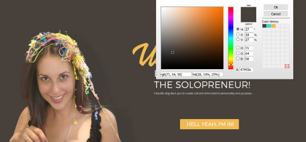
You can also click the eye dropper icon and select ‘Webpage Color Analyzer’ and it’ll pull in every color used on the current page you’re on.
Yep, that’s The Branded Solopreneur (my previous brand) color palette that you can now swipe. But you better not… you don’t want to poke this bear. RAWR! 👉🏽🐻🚫

As promised here’s the bonus method…
BRANDING COLOR PALETTE tool no. 4
Design Seeds
If you’re a no fuss kinda solopreneur and would prefer more of a done for you approach, boy have I got the resource for you, it’s called Design Seeds.
Jessica, the founder of Design Seeds, turns gorgeous Instagram photos into inspiring color palettes (see an example below) and offers them up for grabs.

You can search her color palettes by color (see a screenshot of her color page below), or by collection, which includes categories like The Seasons, In Nature, and Edible Hues, which is where I snagged the coffeelicious palette above.
Tell me you’re not inspired. I DARE YOU!

WRAP UP
While each of these methods will work like gangbusters on their own that doesn’t mean you have to choose only one. They work great in tandem too so don’t be afraid to use a mix and match approach to create your branding color palette!
What matters above all else is 1.) that your palette falls into one of the five types I ran through in the first installment
and 2.) that it has all the color versatility I showed you in the second installment.
Talk about brand-colored glasses! The internet is truly your playground, now go forth and color it how you see fit!
oh, one last thing before you go...
Don't forget to snatch up the brand spankin' new Brand Stying Closet I created for you! It'll not only help you source out, settle on, and style-proof each and every color in your branding palette but it'll help you do the same for every asset in your brand identity - logos, colors, fonts, patterns, and design elements.
Let me show you, pixel-by-pixel, how to create a brand that's as recognizable as your face and original as your DNA so you can create a look, style, and feel that becomes your calling card across the internet...
HOW TO CULTIVATE
BRAND RECOGNITION
WITH A STYLE SO Original IT'S INSTANTLY RECOGNIZABLE
An entire library of brand styling ideas outlined with examples + spiked with "Does yours suck?" sanity checks along the way.
