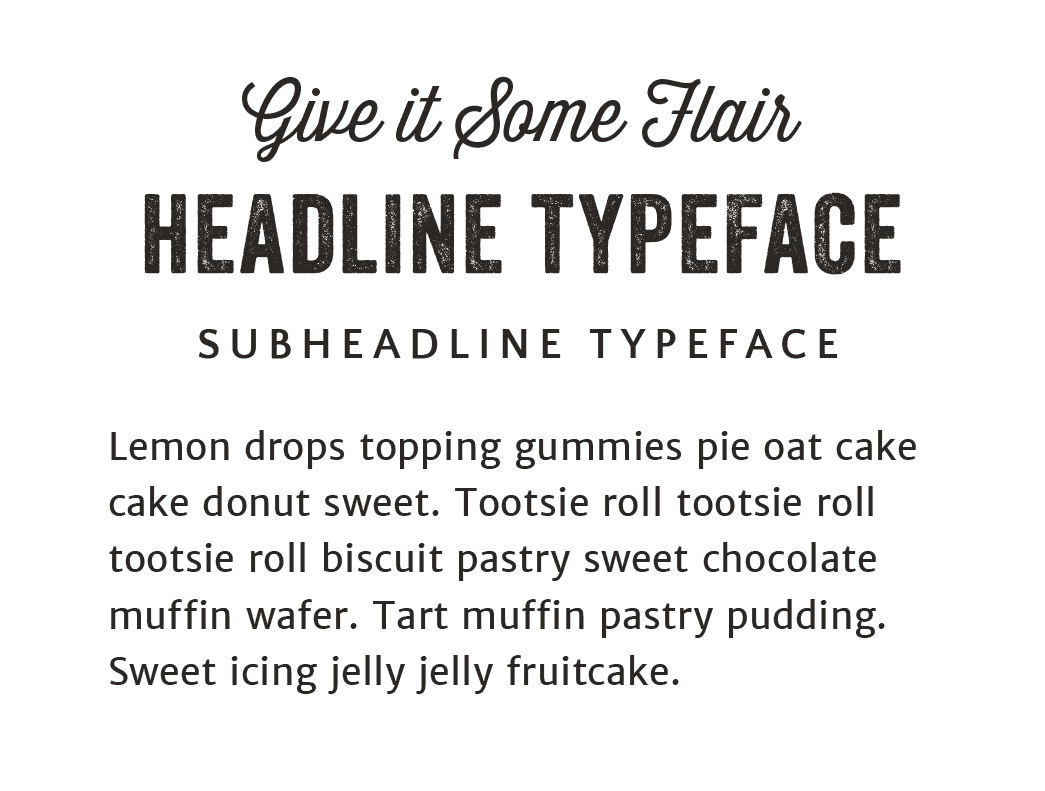
BRAND FONTS
HOW TO Style YOUR BRAND FONTS ON YOUR WEBSITE AND IN YOUR IMAGES
Choosing brand fonts isn’t about finding a bunch of undiscovered fonts that make your content look different, it’s about choosing a set of fonts that fit the atmosphere your brand lives in and defining the specific styling that should be applied to each font, so your typography (the way you arrange the words) looks consistent across your content.
In this lesson, I’m sharing the process I use for creating a brand font theme from the ground up - everything from what fonts you need in your theme, where to search for your fonts, and how to come up with the exact styling to use, so you never have to (over) think how to arrange the words on your website or in your social media images again.
written by: DRE BELTRAMI
reading time: 5 minutes
WHAT BRAND FONTS DO I NEED?
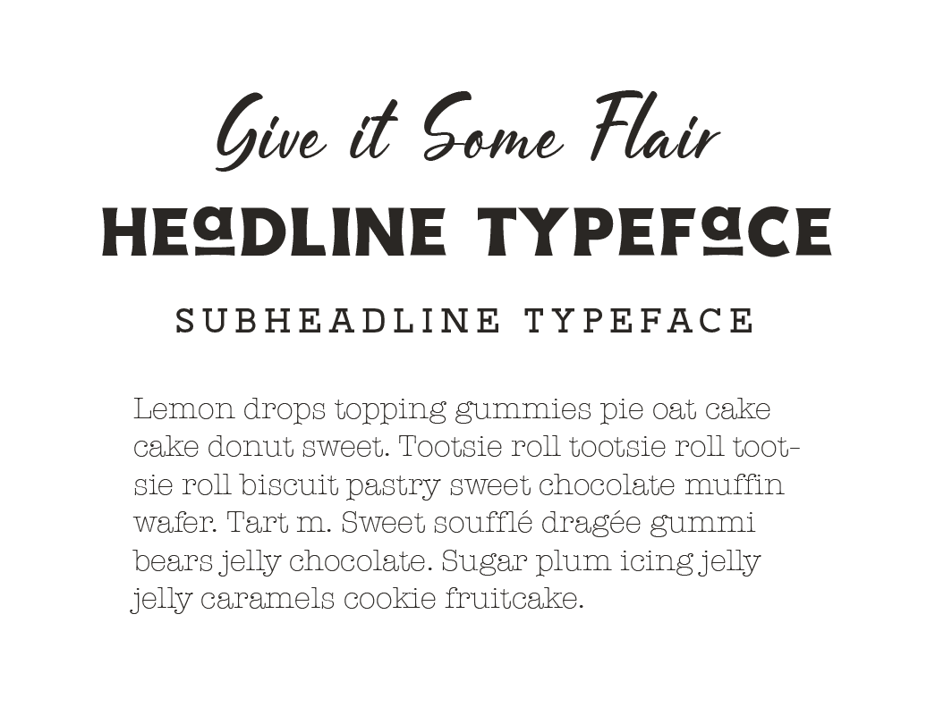
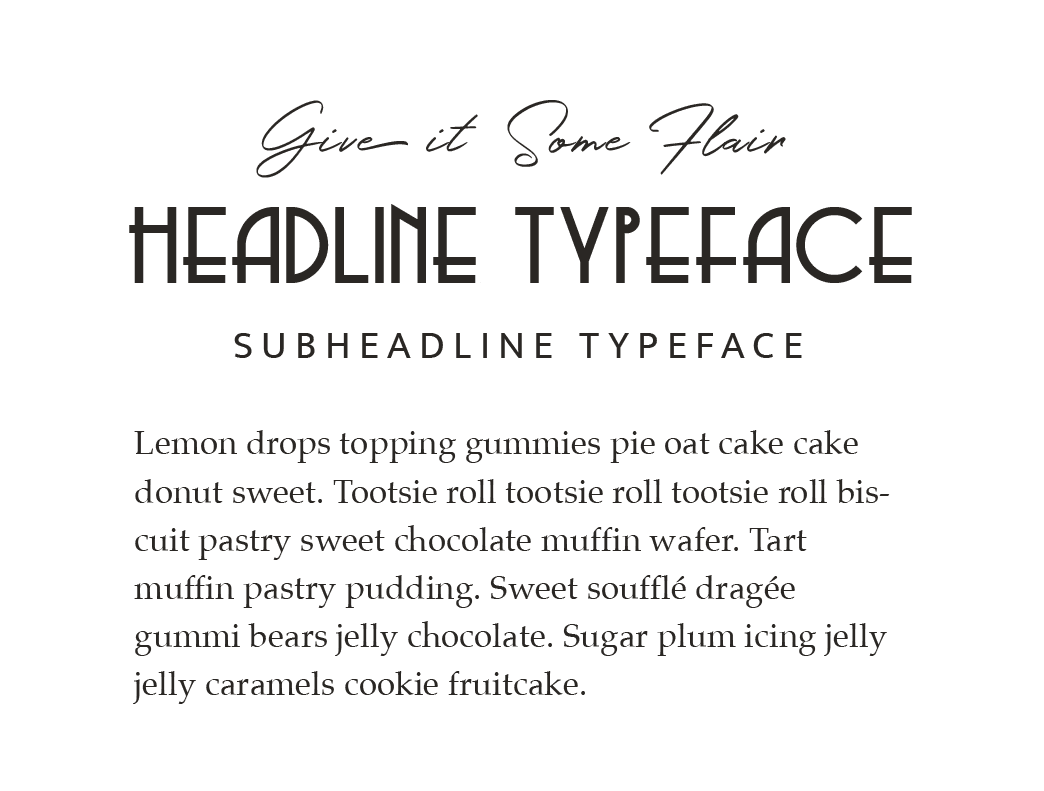
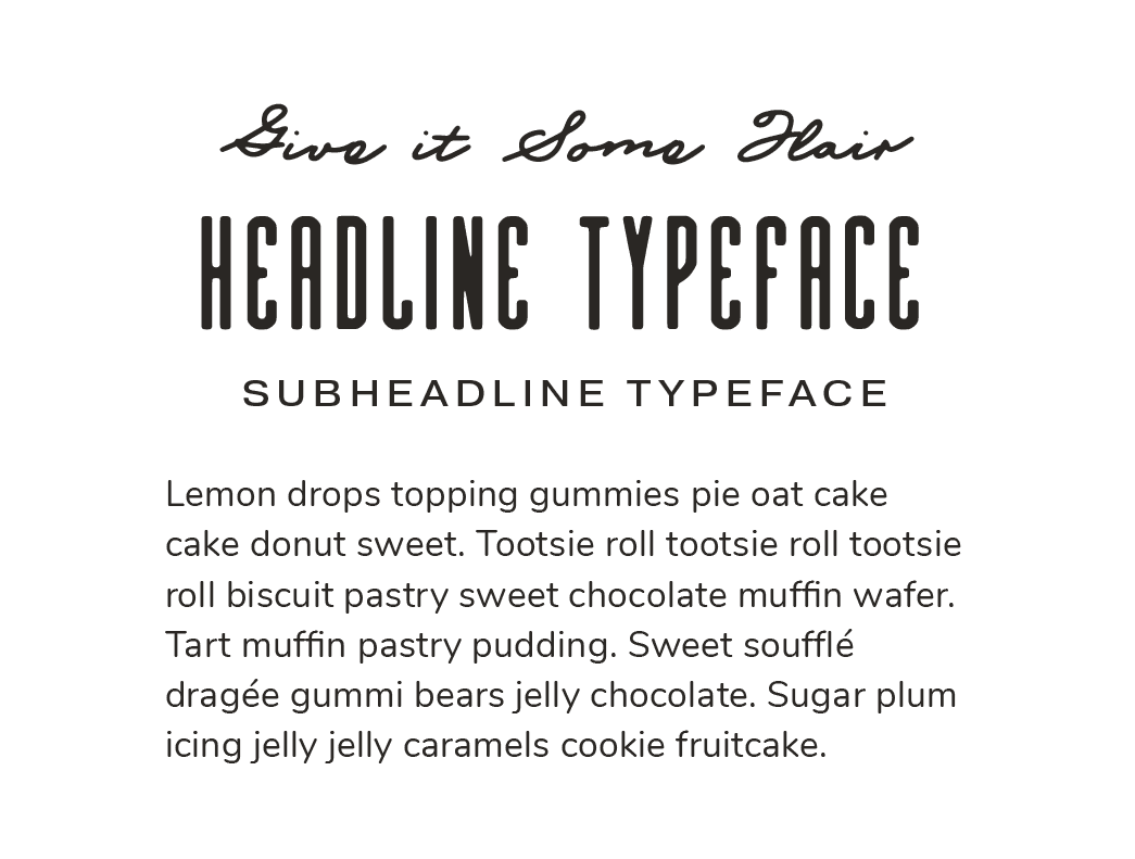
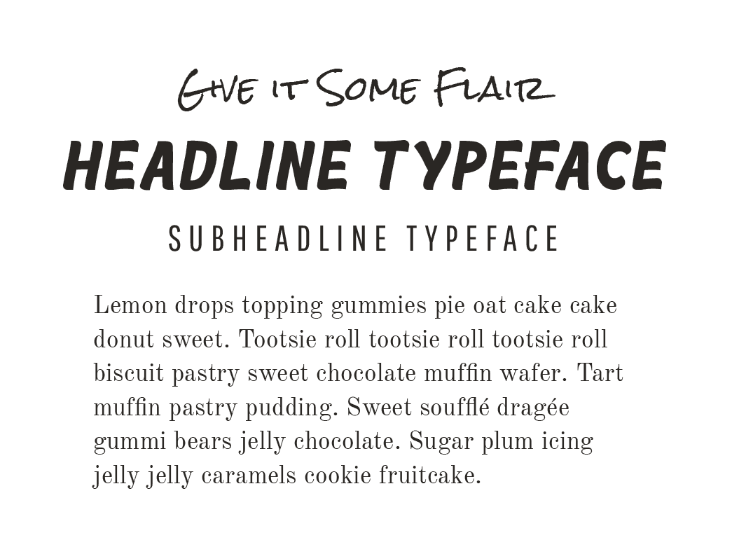
A brand’s identity suite is typically made up of four brand fonts (known as a font theme).
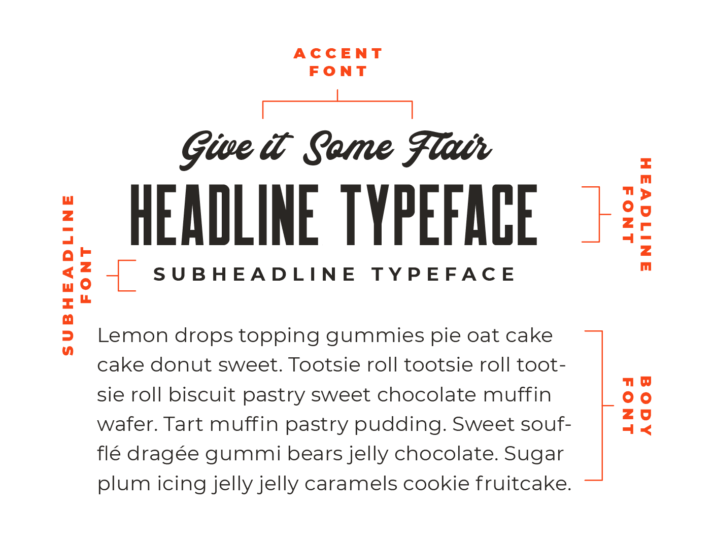
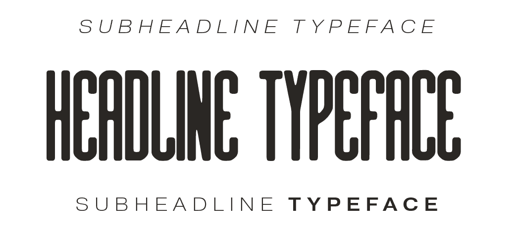
A headline font, which is the most recognizable font (in terms of being associated with your brand) in your font theme.
A subheadline font, which is the most versatile font (in terms of pairing) in your font theme.
An accent font, which is typically either a hand-written or script font.
And a body font, which is exclusively used for all paragraph text and long-form content.
Before you invite a font - which is actually called a typeface - to become a part of your brand identity (because consent is important😉), make sure...
You have the proper license to use the typeface for branding purposes (i.e. commercial use). A lot of the font banks out there offer fonts for personal use only, so make sure you’re searching on platforms that are intended for commercial use.
It’s 100% readable to the member of your family with the rustiest eyes - if they can’t read it on your screen chances are tons of other people won’t be able to either. An unreadable font will only send eyeballs running, which is the last place we want them darting off to, so make sure you don’t (EVAH!) get so decorative you lose readability!
It looks like it was ripped out of the atmosphere you’re creating. You want the typefaces in your theme to be reminiscent of the typography that would actually be found on the signage (and other decor) in that kind environment. If you’re channeling an English rose garden, you’re not going to want a grungy script typeface. Get my drift?
A few examples of brand font themes I've put together for clients.
WHERE SHOULD I LOOK FOR MY BRAND FONTS?
My go-to spots for finding the perfect fonts for my client's brand identities are My Fonts, Creative Market, Adobe Fonts, and Google Fonts.
Each of these resources has a bottomless barrel of fonts that can be purchased for commercial use (meaning, for branding purposes), with the exception of Google - all of their fonts are completely free for commercial use. Thank you, Google! 🍷
HOW DO I MAKE MY FONT THEME LOOK ONE OF A KIND?
One word… styling, baby! (Or does that count as two - I’m overthinking, let’s just pretend I can’t count.)
Once you choose your brand fonts, the real design work starts.
A font out of the box, in other words, with its default properties (which is technically called a typeface), is boring, uninspiring, and not where the magic happens in a brand identity.
The snap, crackle, pop (and what turns your typefaces into fonts) is when you define a set of style guidelines for each that can be used across your content to create a very original look.
Here are my four favorite ways to customize font themes when I’m styling a client’s brand identity.
1.
DEFINING THE SPECIFIC TRACKING TO USE IN YOUR HEADLINE + SUBHEADLINE FONTS
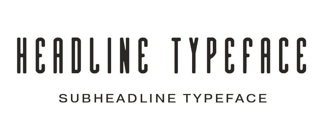
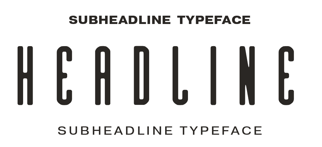
Tracking refers to the spacing between letters.
If you increase or decrease the tracking you can create a very specific (original) look in your headlines and subheadlines.
DECREASED TRACKING (-25)
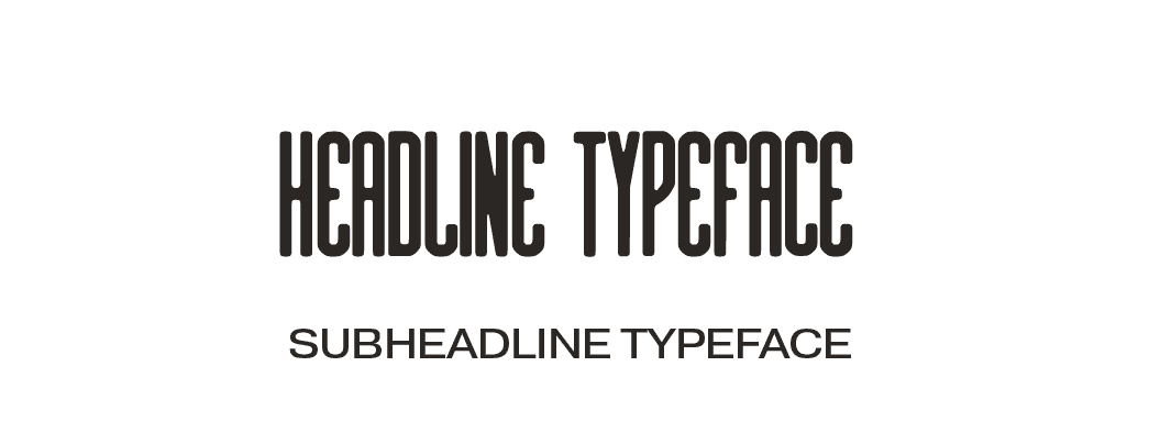
regular tracking (0)
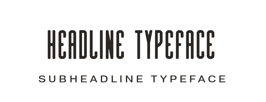
INCREASED TRACKING (200)
2.
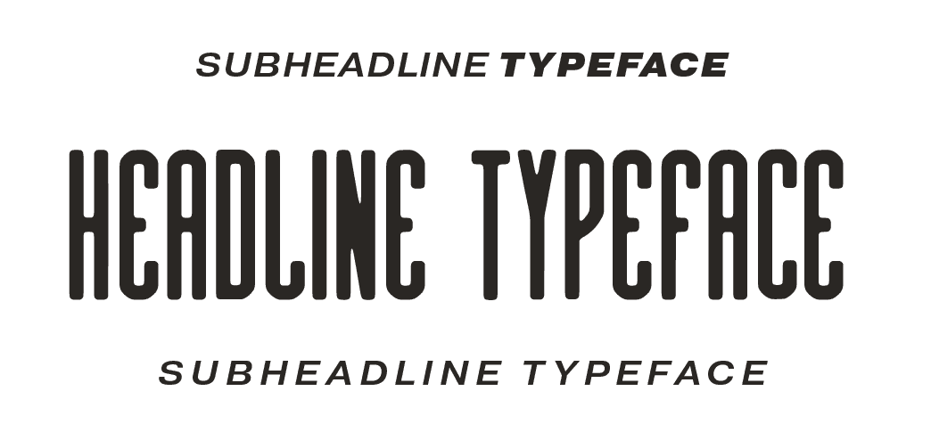
DEFINING WHAT WEIGHT TO USE FOR YOUR HEADLINE + SUBHEADLINE FONTS
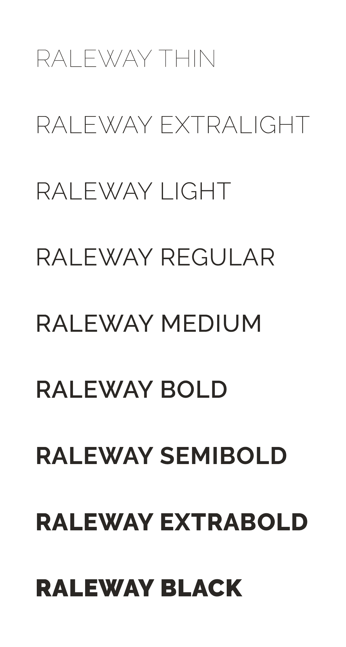
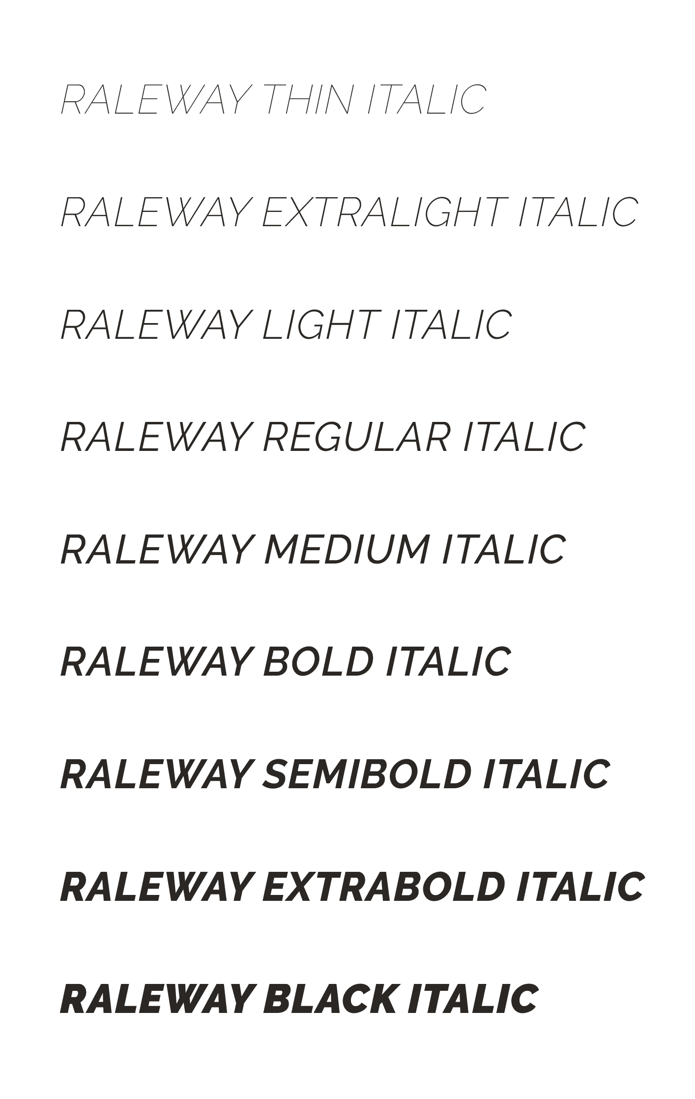
Many fonts, especially serifs and sans serifs are part of a font family, which is a typeface with multiple weights and/or italics available.
These families are great because they give you styling versatility without having to use four different typefaces. For some clients, I use the same font for their headline and subheadline (on occasion, even their body font) because we’re going for a cleaner, more minimal effect for their typography.
Below are the fonts available in the Raleway font family, which include nine weights with and without italics, for a font family that rolls eighteen deep - there's nothing like a ton of options!
raleway font family weights
raleway font family weights with italics
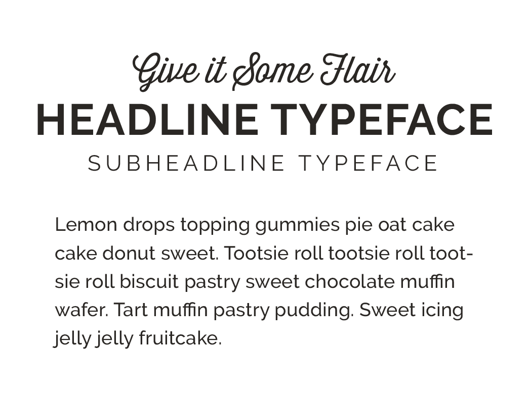
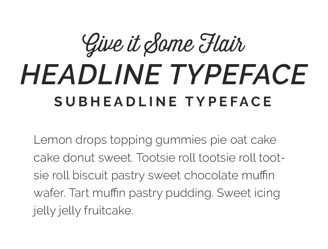
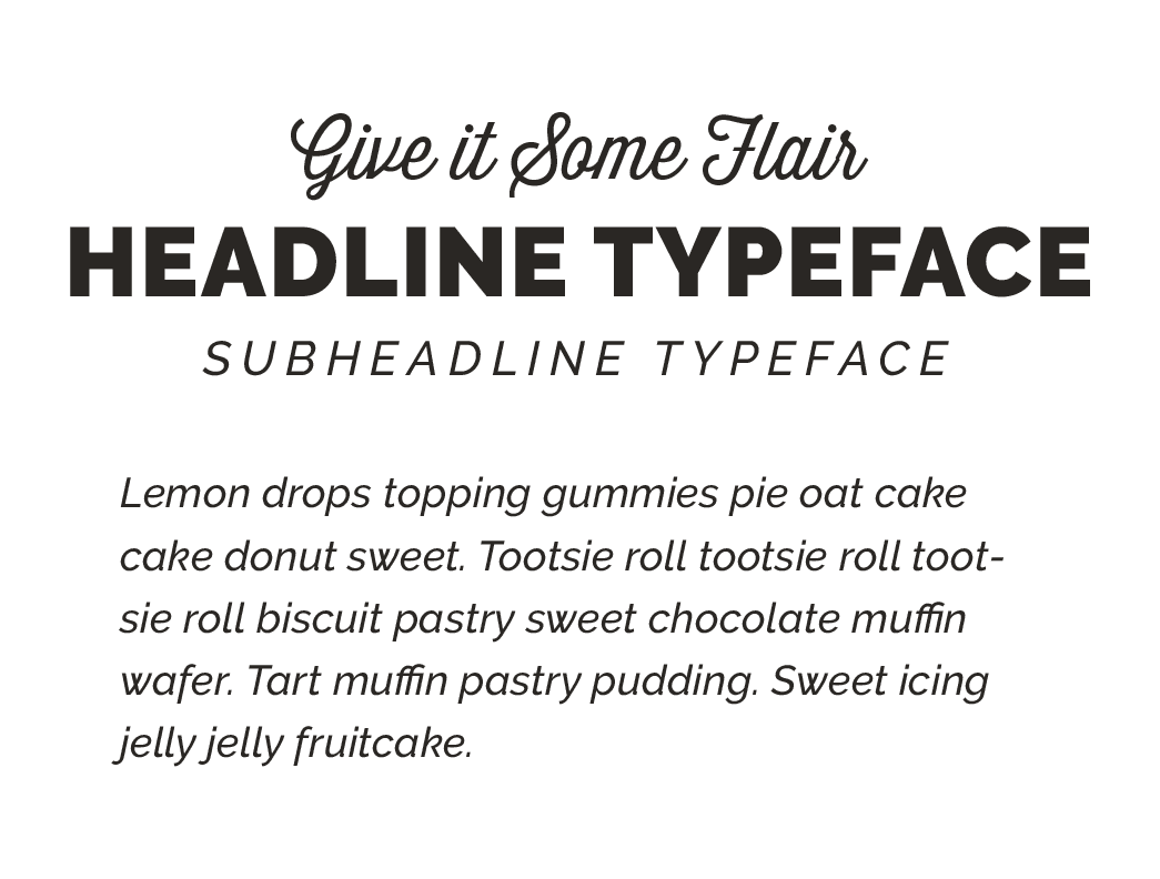
Here are a few font themes that use Raleway for the headline, subheadline, and body font - using different weights and italics.
3.
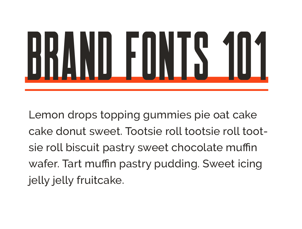
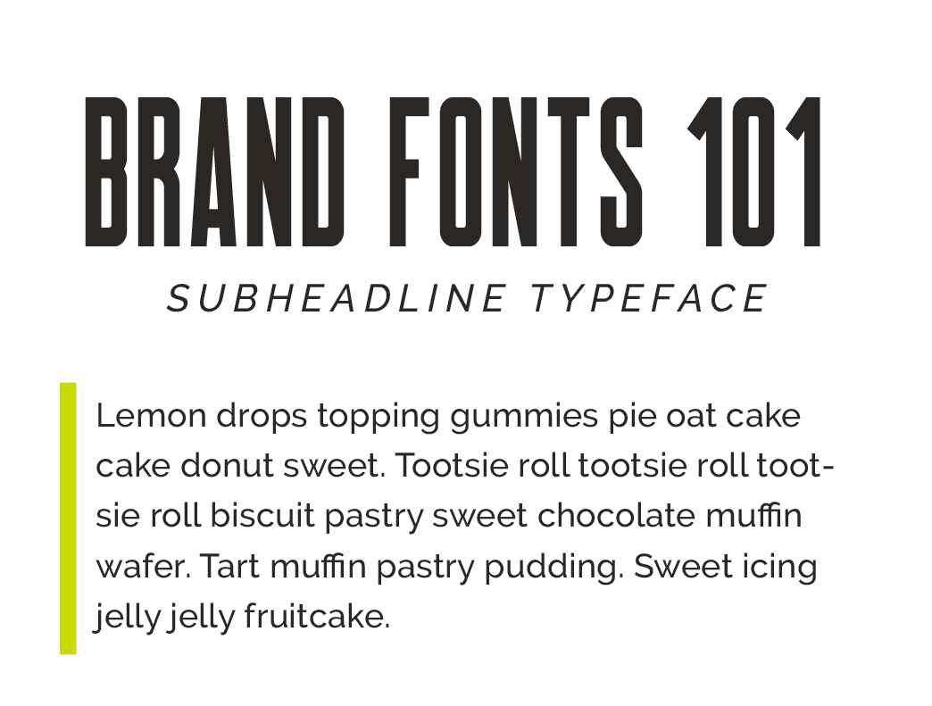
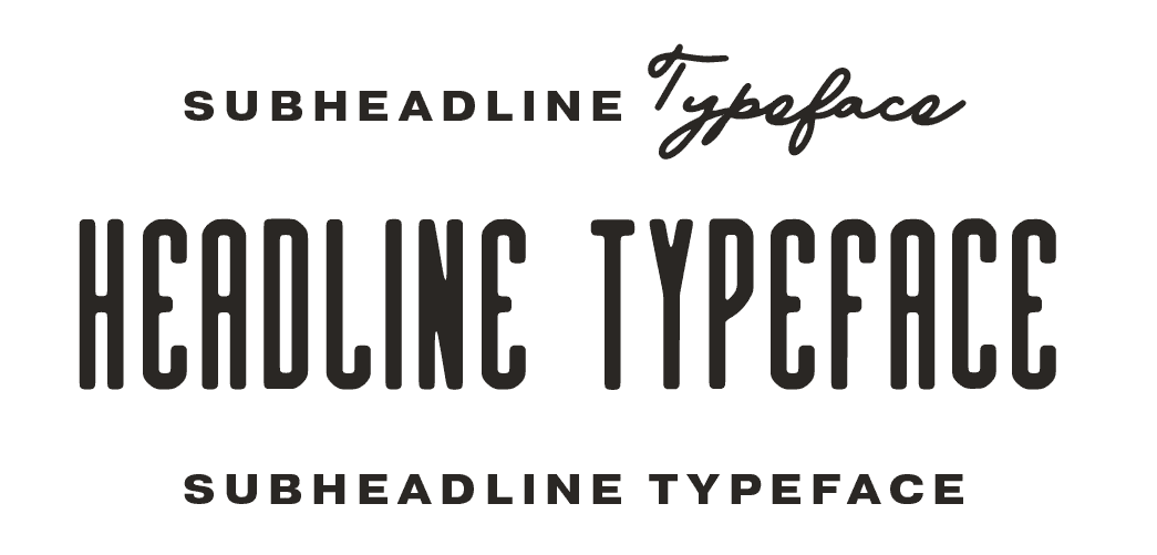
DEFINING A STYLISTIC NUANCE FOR YOUR TYPOGRAPHY
This is one of my f-a-v-o-r-i-t-e ways to style the typography in a brand identity because it’s where you can have the most fun… and creative freedom.
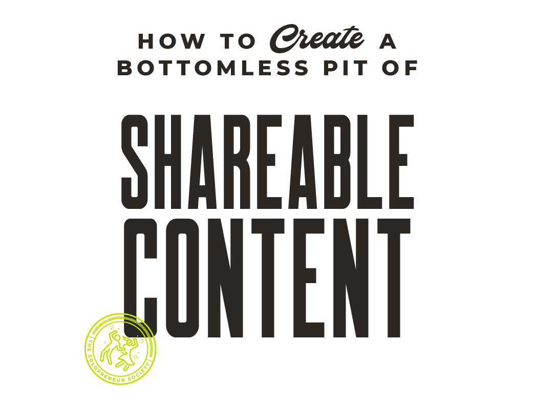
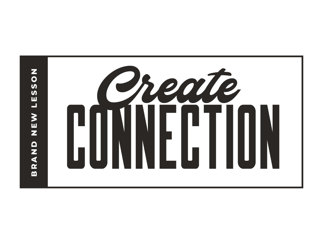
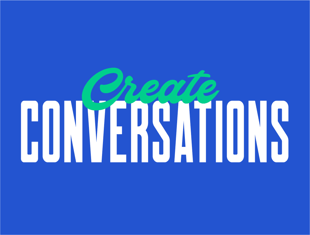
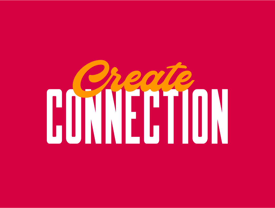
A typography nuance can be anything from pairing a headline or subheadline font with your accent font, to integrating line work into your headlines or body copy, and anything in between.
4.
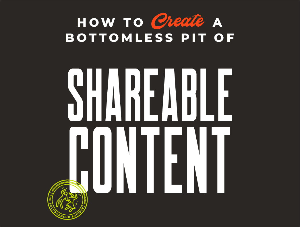
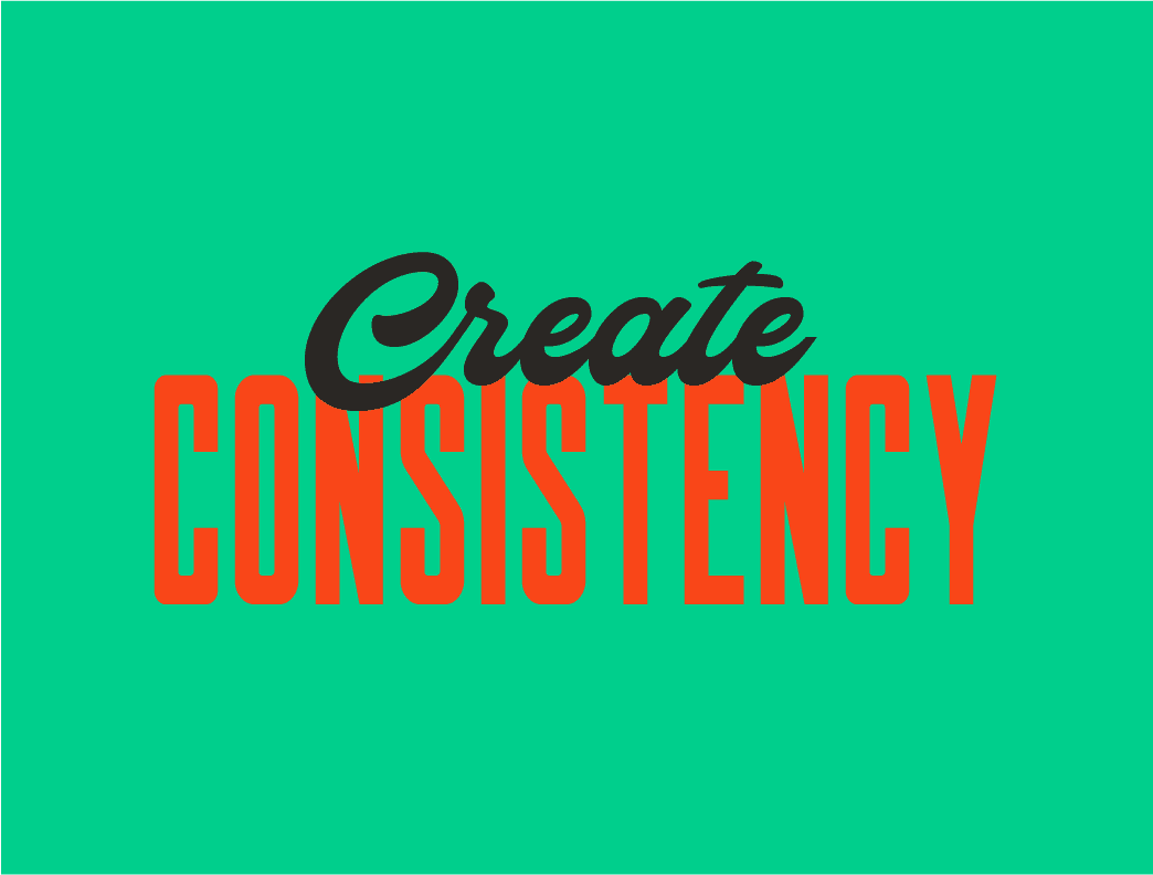
DEFINING THE WAY YOUR COLOR PALETTE IS USED IN YOUR HEADLINES
And last, but certainly not any less epic, is unleashing color into your typography styling.
That could look like anything from assigning a specific color from your palette to apply to the “focus words” in your headlines, to defining the color combinations that should be used within your font theme (to ensure readability) when it comes to your typography. Skies the limit!
HOW TO FIND THE STYLING THAT’S RIGHT FOR YOU.
Part of choosing the right styling for your brand font theme is seeing how the end result will look, which means a proper romp in a "virtual fitting room" is in order. Because...
you're not Really going to know if
you love your
Logo Suite
until you See how it LOOKS in the wild
SAY HELLO TO YOUR
BRAND IDENTITY
FITTING ROOM
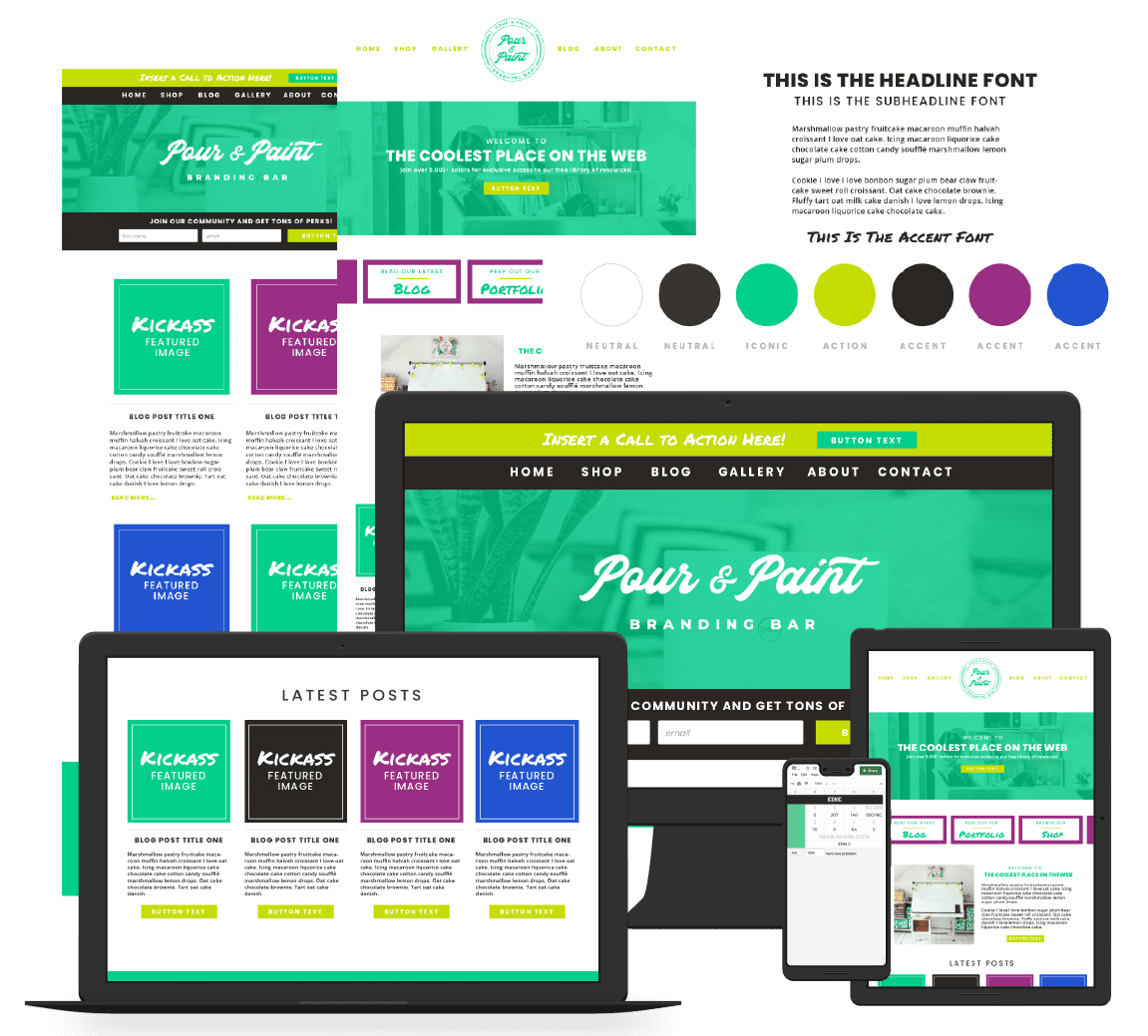
Your own virtual loft, where you can try on and style-proof each and every asset as you design your brand identity to make sure everything comes together like the hand-crafted masterpiece you’re going for.
Or, by all means, bust open your favorite design program and create your own brand fitting room so you can start trying on different styling.
Just make sure you understand the features and limitations that the design program(s) you’re going to actually use to create content come with so you can choose styling that can be accomplished on that platform (and across your content).
Using whichever design platform you’ve chosen, go through the list of styling I ran through above and start applying them to the brand fonts in your theme.
To avoid styling conflicts down the road (when you go to actually create content), you don’t want to define the styling for each font separately. What I like to do is type out a headline (using the headline font) and two subheadlines (using the subheadline font) - placing one above the headline and one below the headline. Then, I can see how both of those fonts and the styling I choose will actually play together in my content.
TRYING ON DIFFERENT BRAND STYLING
From there, I’ll start applying styling, first to the headline and then to the subheadlines. I’ll create tons of copies of the original headline and double subheadline and play with different types of styling to see what looks the most readable, original, and versatile - because your content will come in all shapes and sizes.
Then, I add a line with my accent font and a paragraph of body copy and I keep working through the styling options. I let myself play and as styling comes up that I like, I move that typography to the side and narrow things down until I have a defined set of style guidelines.
We don’t want to get so rigid in our styling that our font theme is a one trick pony that doesn’t actually work in most of our real world uses. Give yourself lots of options but make sure everything works universally, not only with certain word combinations.
Here are a few examples of the same font theme with different styling applied.
BRAND FONT STYLING INSPIRATION
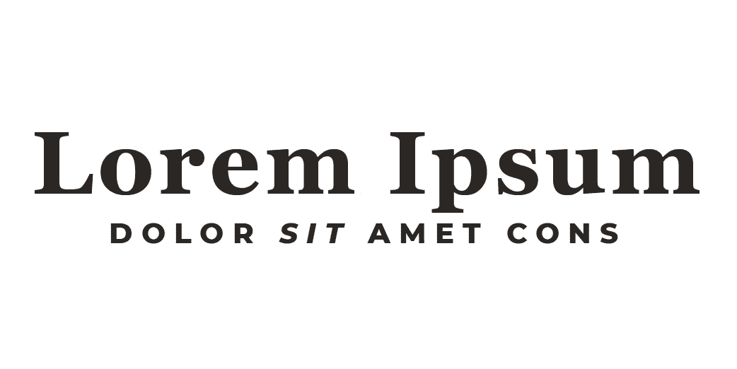
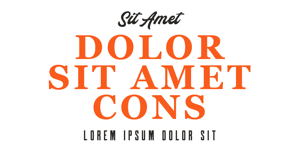
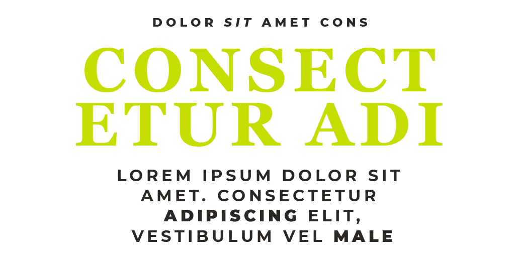
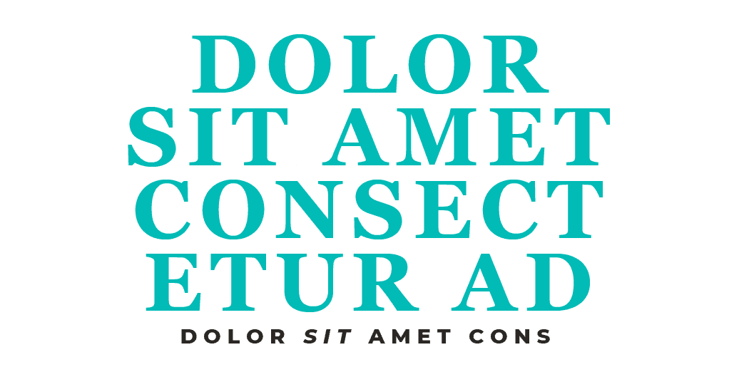
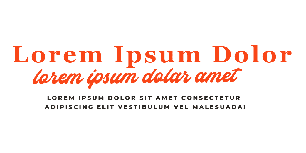
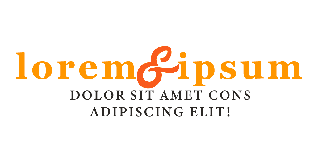
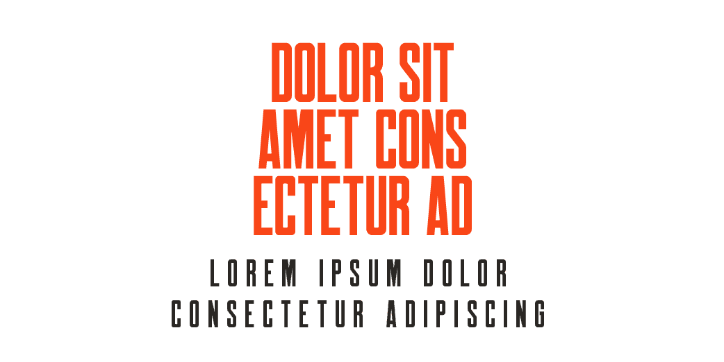
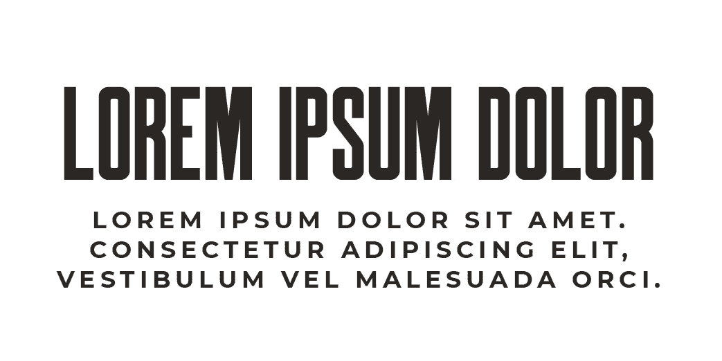
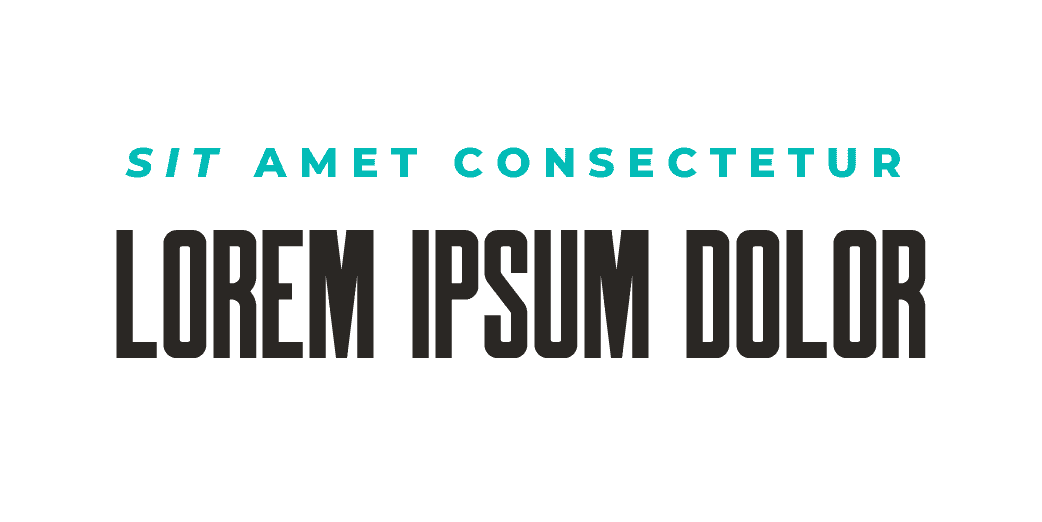
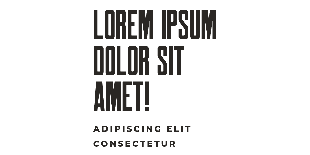
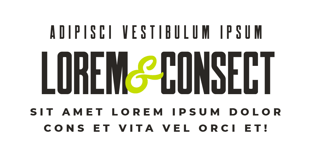
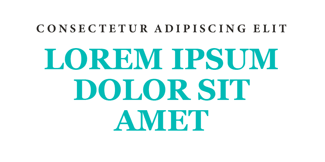
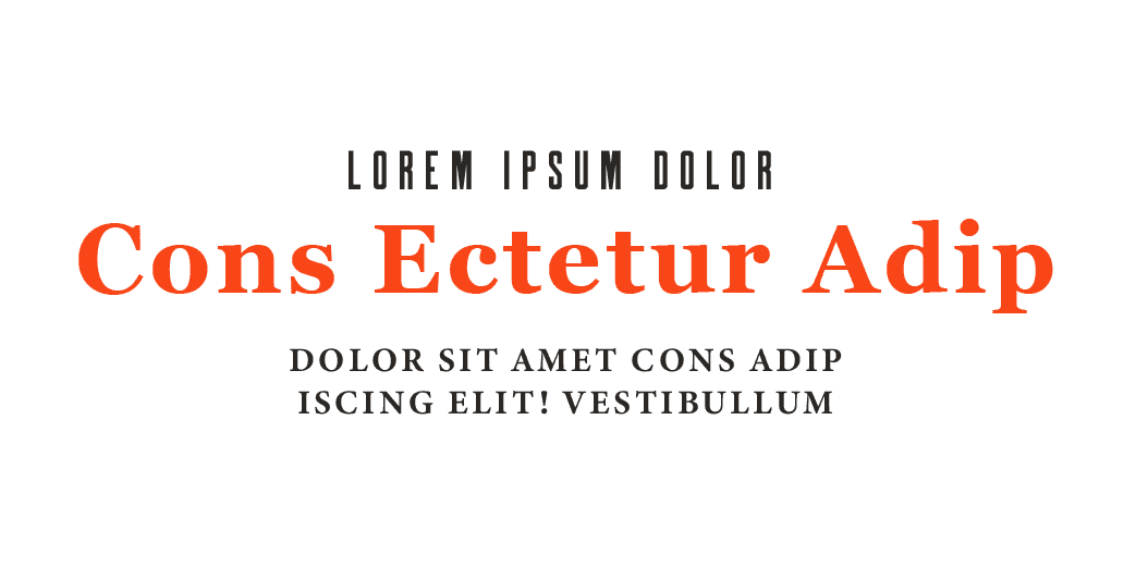
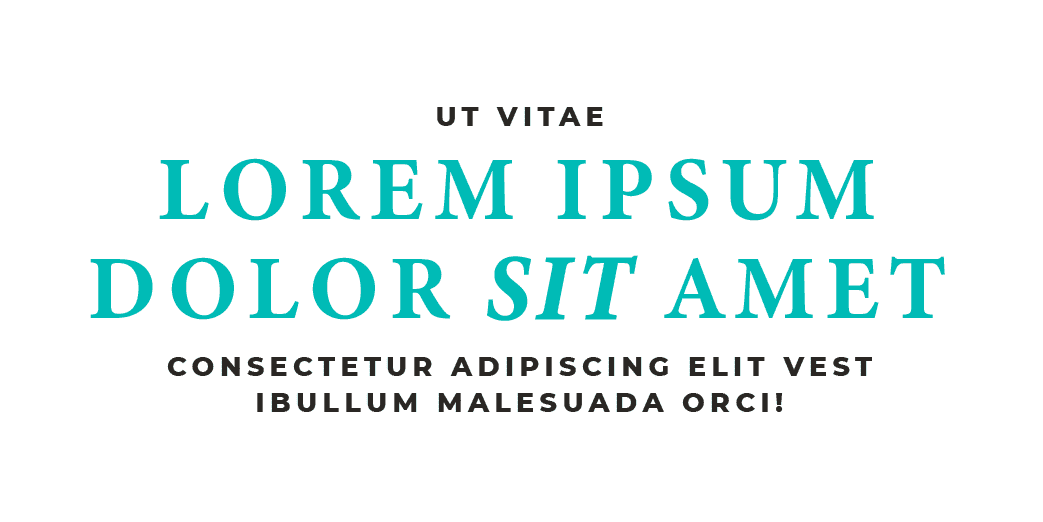
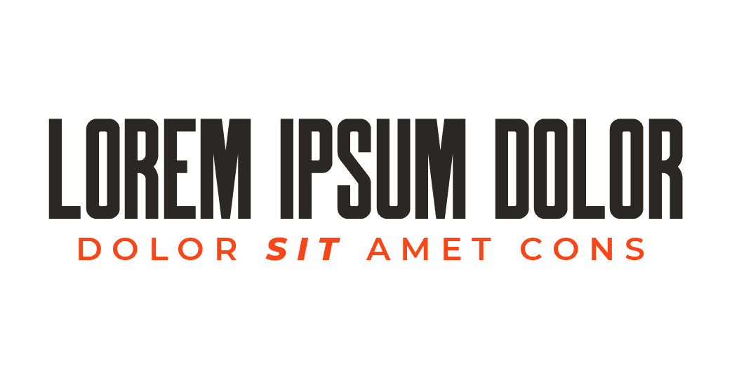
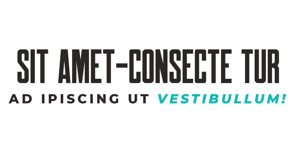
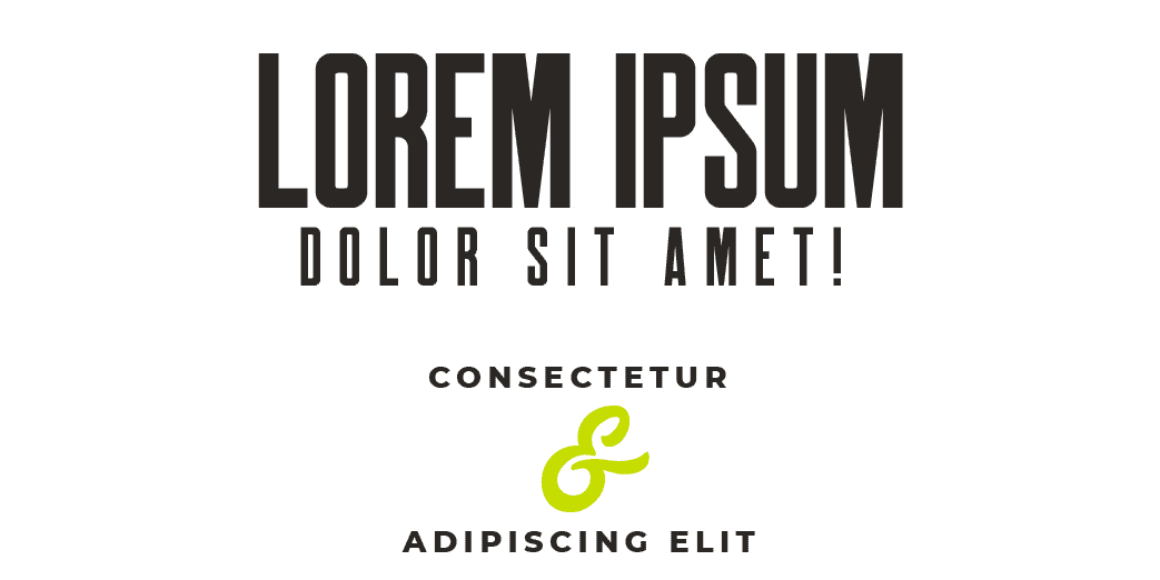
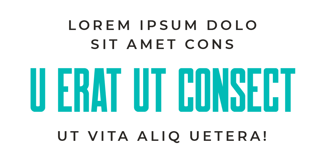
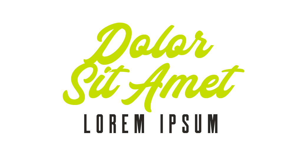
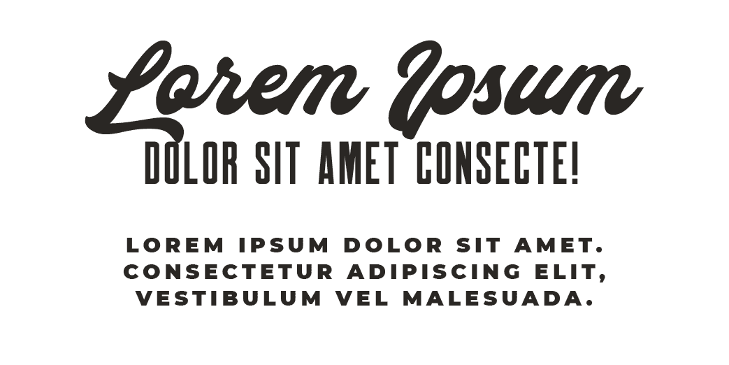
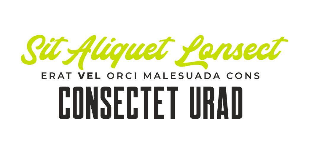
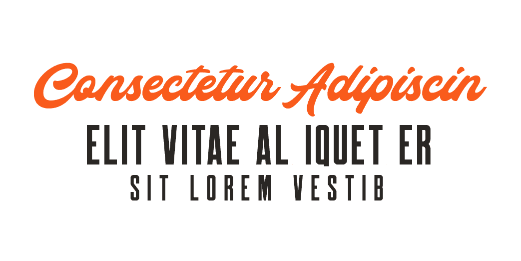
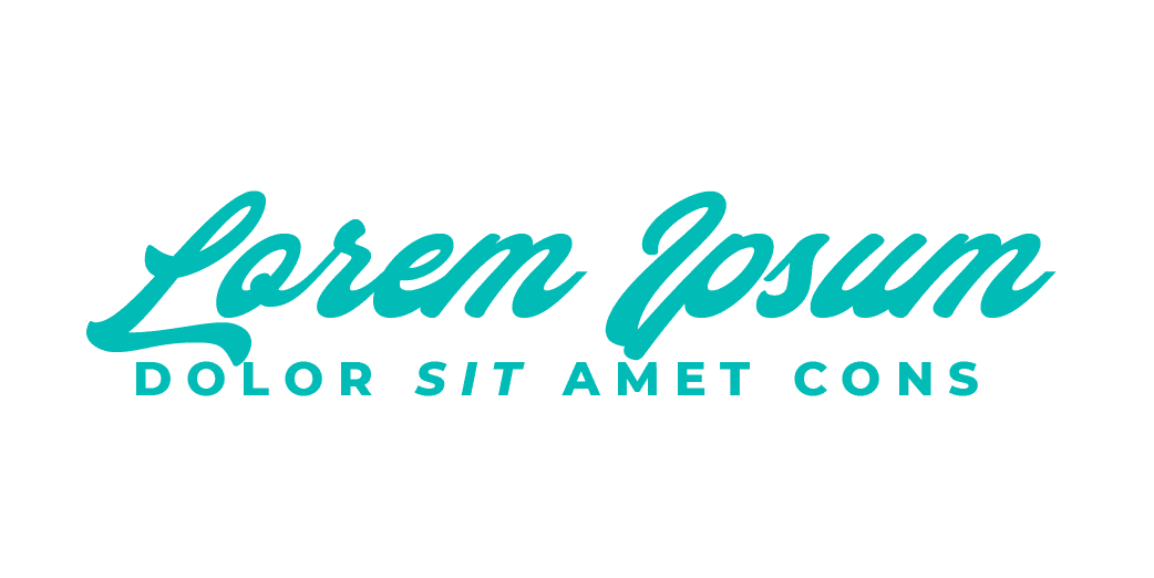
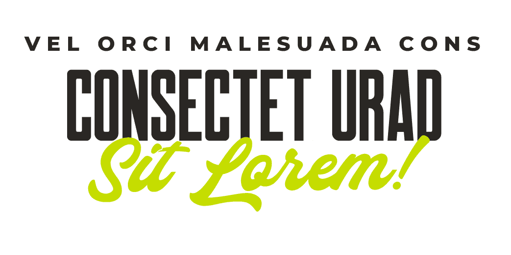
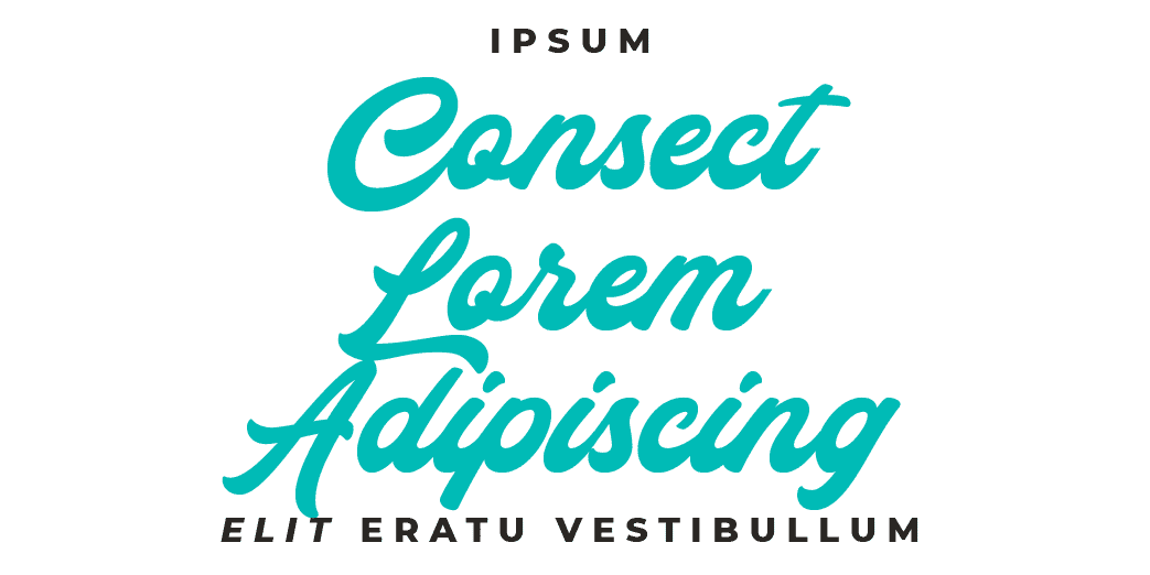
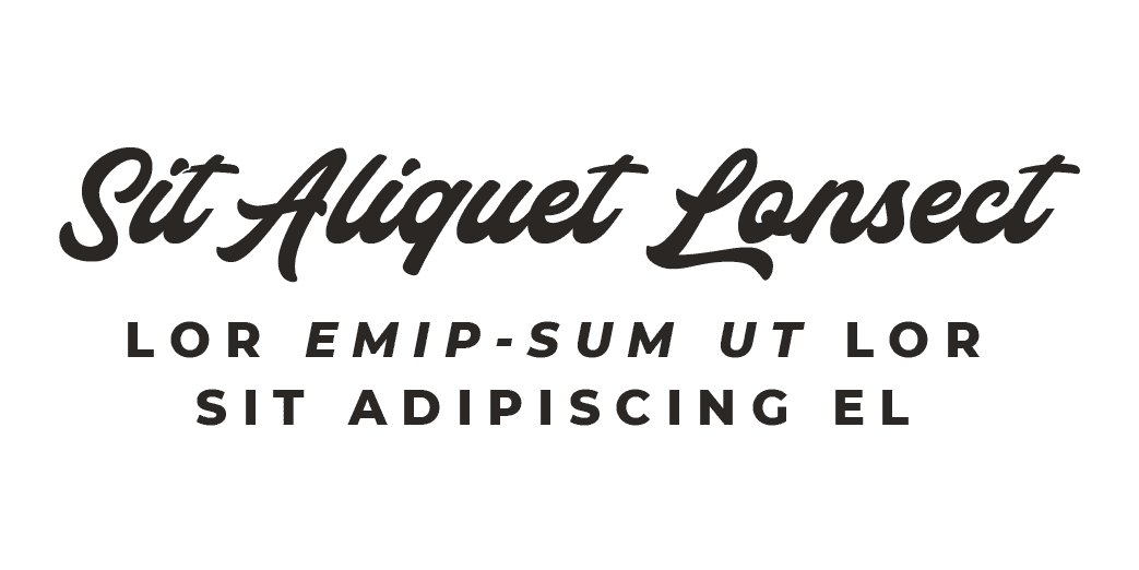
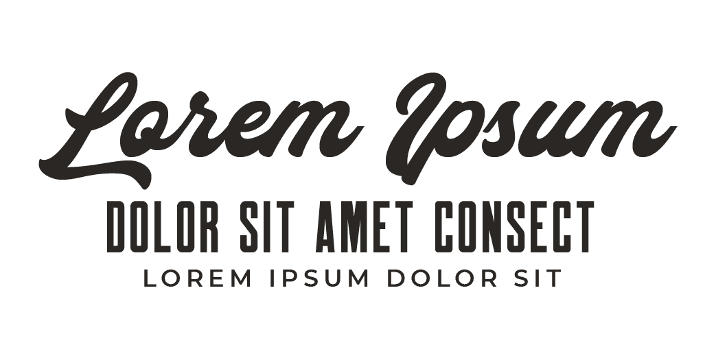
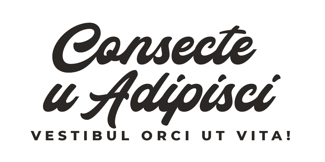
To get those creative juices flowing, I’ve put together thirty styling examples using a serif, san serif, and script font (which are almost all from my brand font theme) so you can see how styling definitions create continuity and brand recognition across your content - not to mention cut your actual design time down to a fraction.
Here's my font theme, and below that are tons of styling options that I encourage you to use as inspiration for the styling of your typography.

Styling samples for inspiration ONLY!


ROLLING OUT YOUR FONT STYLING ACROSS YOUR WEBSITE AND IMAGES
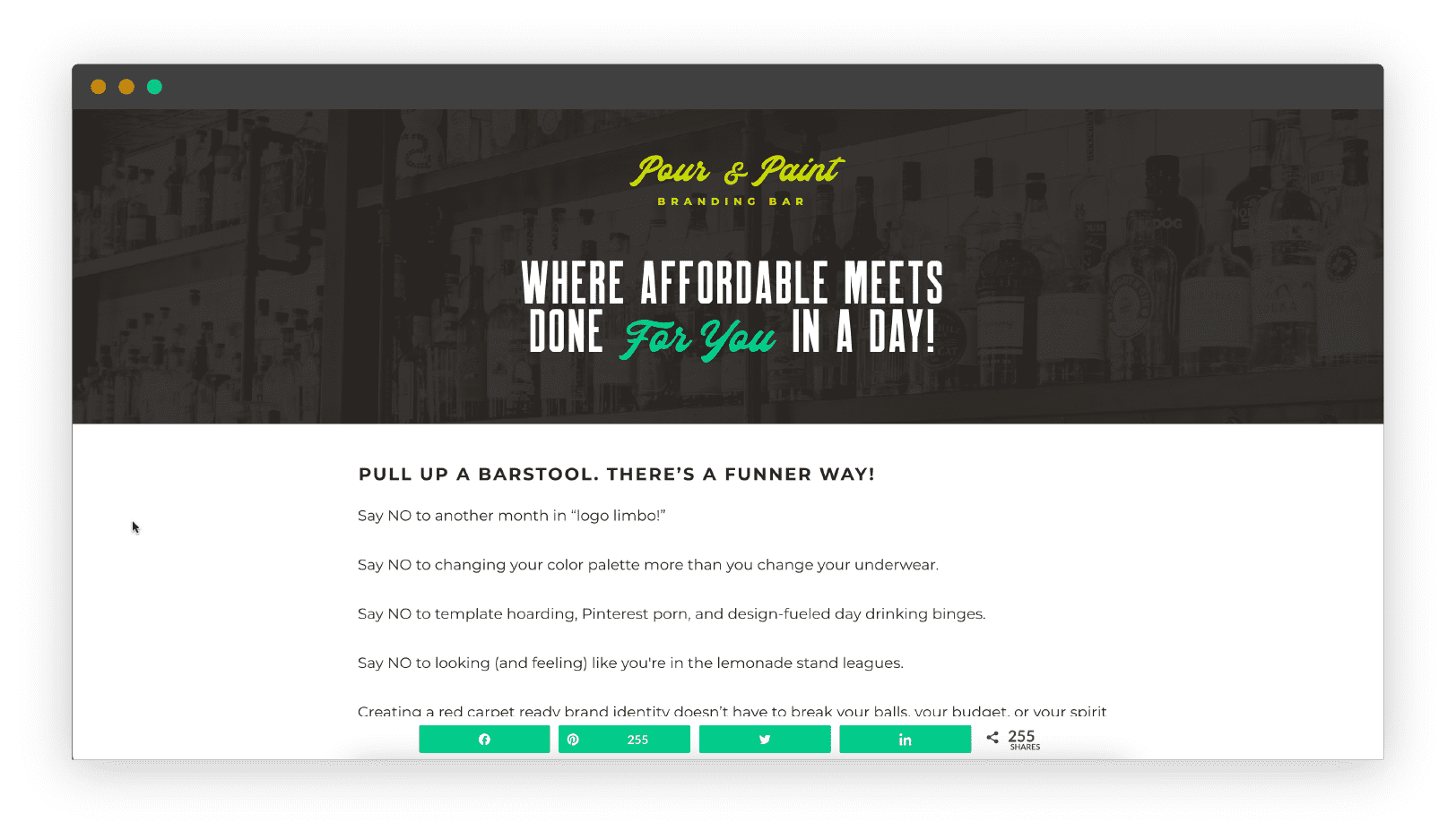
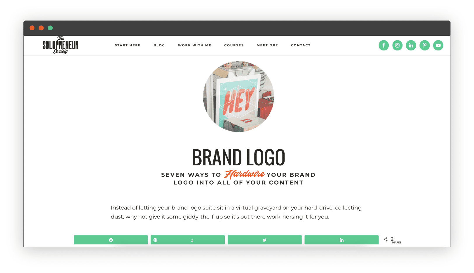
Here are some content examples from yours truly, including one of my blog posts, a Pinterest pin image, a sales page header, and a blog post, so you can see how the styling definitions you create for your brand fonts can look in the wild, across your content, when you stick to them. 🥳

I DOUBLE-DOG-DARE YOU TO...
To take the half-baked approach out of arranging the words on your website and images and create a brand font theme that comes complete with pixel-by-pixel styling definitions, so you never have to (over)think about how to design the words on your visual content… EVAH again!
If you need help coming up with a smokin' hot, original AF brand identity, I got you, Boo. Your branding survival kit is packed and ready for pickup...
when it comes to creating a
BRAND IDENTITY
you've gotta come prepared!
say hello to your
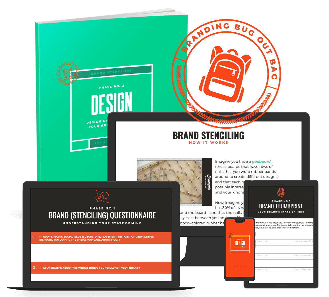
BRANDING bug out bag
Your very own branding survival kit, fully stocked with everything you need to create a handcrafted brand identity that's as original as a fingerprint and addictive as a two for one happy hour, so you have peace of mind knowing that the only buzz you're creating is the kind that's contagious.
