
BRAND colors
HOW To OWN YOUR BRAND COLORS SO HARD PEOPLE CAN'T HELP BUT Think of You WHEN THEY SEE THEM
There’s a big, fat, hairy secret about brand colors that nobody talks about. Dun, dun, duuuuun… Not all colors are created equal!
Some branding color palettes (as a whole) SUCK, but most of the time it’s the way a brand is using the their colors that sucks.
In this lesson, I’m going to help you style-proof each and every color in your palette to make sure it passes the “suckage test” so you can make your color palette so synonymous with YOU that the moment people see it they immediately think of you.
written by: DRE BELTRAMI
reading time: 5 minutes
HOW TO MAKE SURE YOUR COLOR PALETTE DOESN’T SUCK
Before we get into when, where, and how to use each and every brand color in your branding color palette, I want to help you figure out (once and for all) if your palette sucks so you can fix anything that needs to be tweaked.
Here are the four benchmarks you want to be able to say "hell yeah" to before you put a ring on your color palette...
1. Does it fit into one of the five types of branding-approved color palettes?

Creating an iconic color palette for your brand isn’t just a matter of personal taste… or favorite colors. That’s what your bedspread and throw pillows are for.
Some colors combinations just aren’t idea and some colors just don’t render well when it comes to brand design. Remember, your brand colors have to translate in print… and digital… on different screens… in cluttered feeds… in almost every way you can think of.
Not every color combination can cut it in this rainbow-eat-rainbow world, so make sure your palette has a branding “temperament” before you call your palette "perfection".
2. Does it have 5-7 colors in it?

You want to have enough color to be able to draw someone’s attention where you want it in your content, but not so much that it looks like Candy Land threw up all over your shit.
I’ve found that 5-7 is a nice sweet spot, whether you’re using all different colors or 1-2 main colors with a couple tints and hues of each, to give you plenty of styling versatility without going overboard on the actual colors.
Here are some examples of perfectly-sized branding color palettes...

5-swatcH color palette

7-swatcH color palette

5-swatcH color palette

7-swatcH color palette
3. Has each brand color been given a specific styling purpose that works?

I can’t tell you how many times I’ve color-styled a client out of $2K rebrand.
So, so, soooo many times the piece a brand is missing, when it comes to their brand identity, is styling definitions for their color palette. It’s the simplest fix but it makes a huge difference.
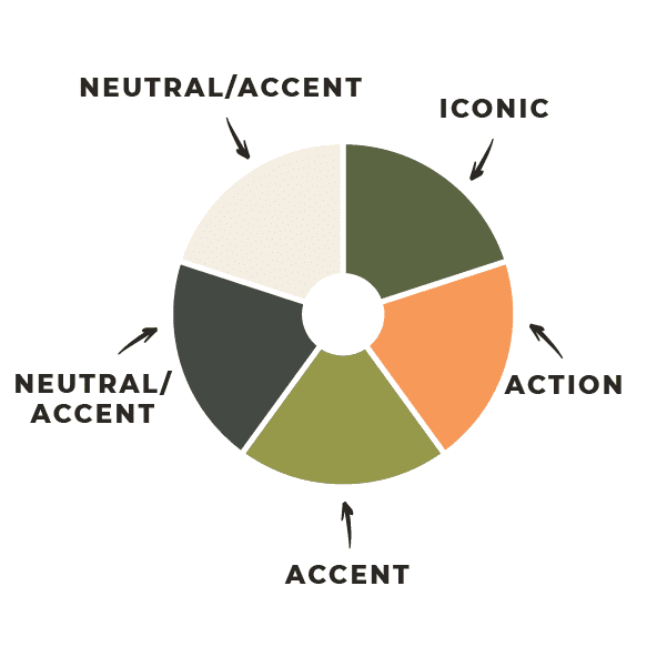
There are four primary styling purposes when it comes to the brand colors in your palette:
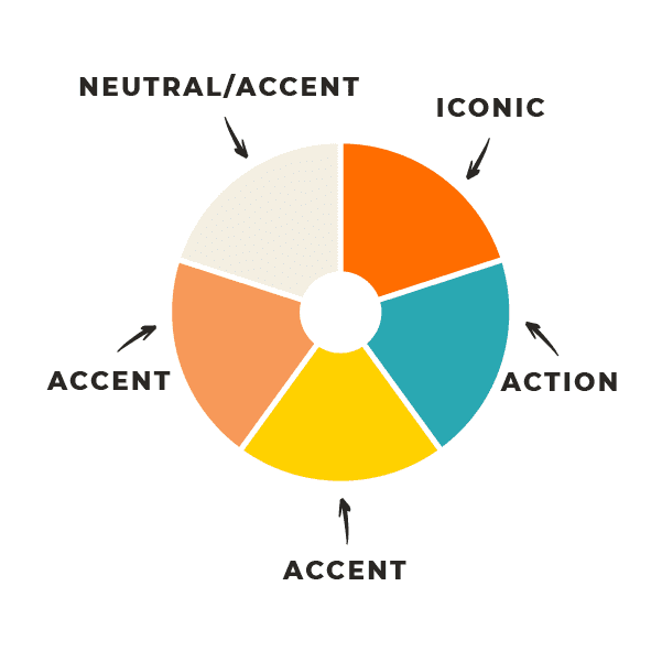
Your iconic color, which is the primary color you want associated with your brand.
Your action color, which is the color you want reserved for links, buttons, and calls to action.
Your light + dark neutral color(s), which are the colors reserved for copy and backgrounds.
Your accent colors, which are the colors you’ll use to interrupt your basic color scheme when you want to accentuate something special, which typically includes 2-3 colors.

5-swatcH color palette

7-swatcH color palette

5-swatcH color palette

7-swatcH color palette
Part of assigning your brand colors style-purposes is understanding the job you’re giving them and making sure that they’ll work in the ways you want them to. You may love the iconic and action colors you’ve chosen but do they love each other?
When you put a button with your action color on a background with your iconic color… does the button POP? If the answer is anything short of “hell yeah!” then I highly suggest you reconsider the colors you’ve chosen.
The goal is to style-proof each and every brand color you choose so you know when, where, and how to use each one because it takes consistency across your content to create recognition with your brand color palette.
4. Does your color palette capture the spirit of the atmosphere you’re creating?
If you pick a branding-approved palette + all of your brand colors work with the styling-purposes you’ve given them and things still don’t feel quite right it’s probably because the entire palette is off-vibe.
If you aren’t crystal clear on the real-world-inspired atmosphere you want your brand to live, you aren’t ready to choose colors, or any other branding design assets!

Your colors are an extension of the specific atmosphere you want your customers to feel like they’re stepping into when they enter your slice of the internet - I call this your happy place.
This happy place is where you would take your kindreds (what I prefer to call ideal customers) to complete your work together, if money was no object and happiness was the only objective on the menu?
When you think about your happy place what colors do you see? If those are the ones in your palette, you’re on-vibe. If not, that’s the why things still feel off.
Color can feel insignificant sometimes but I pinky promise you that once you understand how to choose the right branding color palette and how to wield your brand colors like the secret ‘visibility’ weapons they are, your color palette will end up becoming the most significant piece of your entire brand identity.
The good news: Brand colors are almost instantly figure-out-able once you’re intimately familiar with your brand’s your happy place, so get your brain cells all up in there and daydream away!
The cool part about knowing if (and why) your color palette sucks is that now you know exactly how to fix it. And if you need some help trying different color palettes or brand colors on, I’ve got a Brand Fitting Room you’ve GOTTA hopscotch into.
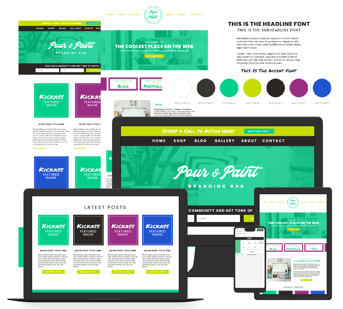
Welcome to your
BRAND IDENTITY
FITTING ROOM
Your own virtual loft, where you can try on and style-proof each and every asset as you design your brand identity to make sure everything comes together like the hand-crafted masterpiece you’re going for.
WHEN, WHERE, AND HOW TO USE EACH OF YOUR BRAND COLORS

Once you have a branding-approved color palette (with style-purposes assigned) that looks like it was ripped out of your happy place, you’re ready to start painting the internet with your brand rainbow.
Here’s a charcuterie board worth of ways you can own each of your brand colors so hard they become synonymous with your brand, conveniently organized by style-purpose, so you know when, where, and how to use each and every color in your brand identity color palette.
Your iconic brand color should be worked into every single piece of content you create so you can reinforce it’s connection to you. That means this color has to work beautifully with every single color in your palette.
You can hard-code your iconic color into everything from your typography styling to your photography styling, and every stylistic nuance in between.
Here are several content styling examples to get your creative juices flowing…
Click any image tile below to eye-guzzle the full size image
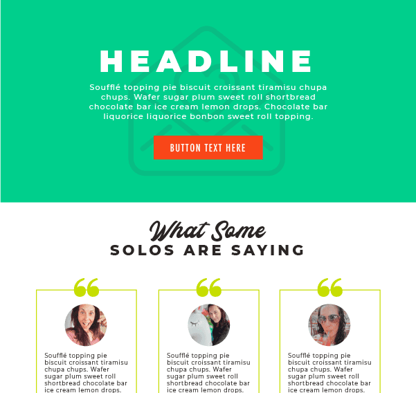
website background section color
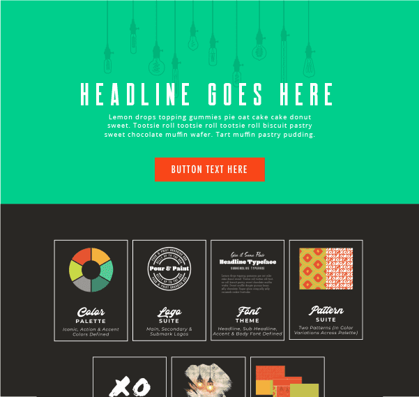
website background section color

IMAGE TEMPLATE

IMAGE TEMPLATE

IMAGE TEMPLATE

IMAGE TEMPLATE

PHOTOGRAPHY STYLING

PHOTOGRAPHY STYLING
FIND BRAND-RELATED PHOTOGRAPHY THAT FEATURES YOUR ICONIC COLOR

FIND BRAND-RELATED PHOTOGRAPHY THAT FEATURES YOUR ICONIC COLOR
FIND BRAND-RELATED PHOTOGRAPHY THAT FEATURES YOUR ICONIC COLOR

FIND BRAND-RELATED PHOTOGRAPHY THAT FEATURES YOUR ICONIC COLOR
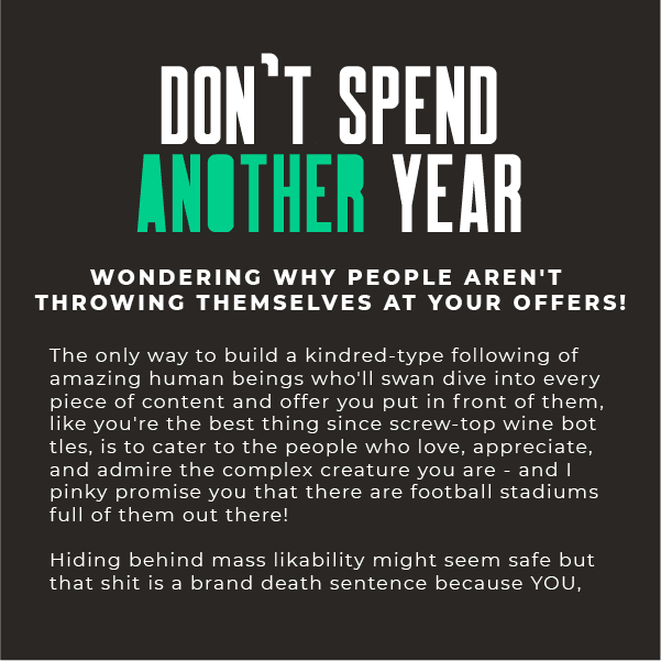
HEADLINE STYLING
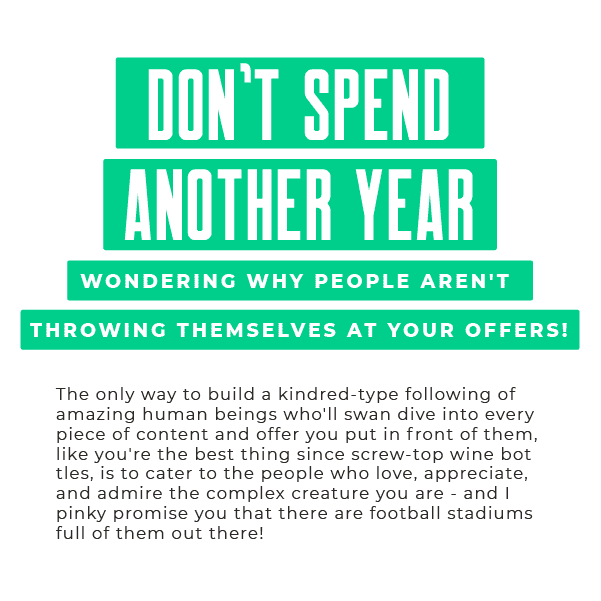
HEADLINE STYLING

HEADLINE STYLING
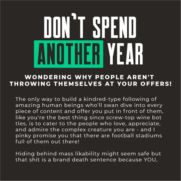
HEADLINE STYLING
Your action color should be reserved exclusively for links, buttons and calls to actions, and is typically the color that’s used the most sparingly but frequently so choose wisely!
This is the color you’ll use to draw attention to the action you want someone to take, so make sure it not only POPS off your iconic color but all of the colors in your palette. You never know when and where you’ll drop an action taking nugget so the more versatile your action color is, in terms of how well it stands out next to the other colors in your palette, the better.
Here are several ways you can hard-code your action color into your content…
Click any image tile below to eye-guzzle the full size image
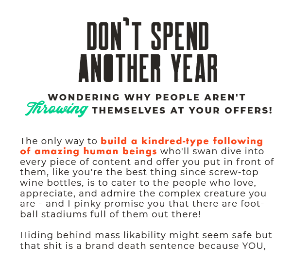
static link
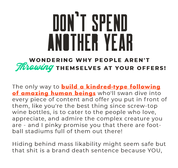
link on hover
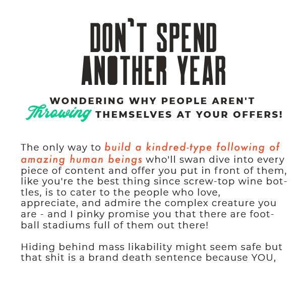
static link

link on hover

static button styling

button styling on hover
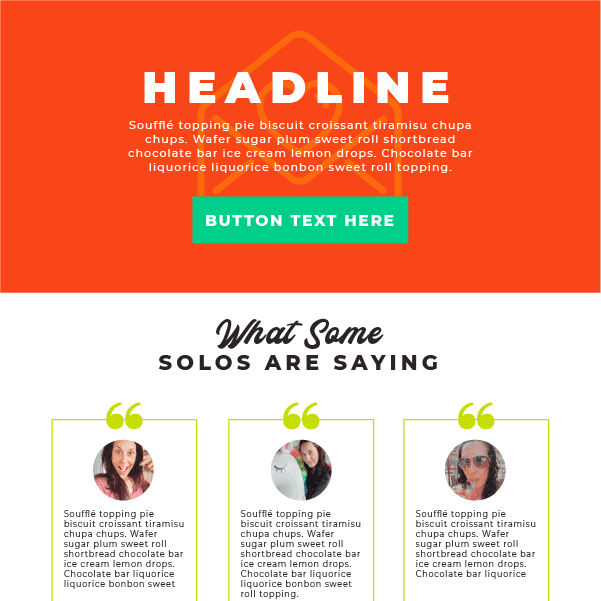
cta background section color

CTA BACKGROUND SECTION COLOR

CTA HEADLINE ACCENT WORD STYLING

CTA HEADLINE ACCENT WORD STYLING

ICONS POINTING TO ACTION ITEMS

ICONS POINTING TO CTA SECTION BELOW
Your neutral brand colors are the most simple and straight-forward to use. They’re there to use for backgrounds and copy on your website, PDFs guides, and emails.
Things don’t always have to have a high production value. Sometimes you just need words and white space. Defining a neutral color or two (usually one on the black side and one on the white side of the color spectrum) means even the most natural pieces of your content will be dripping with your brand vibe.
Here are several ways you can hard-code your neutral color(s) into your content…
Click any image tile below to eye-guzzle the full size image
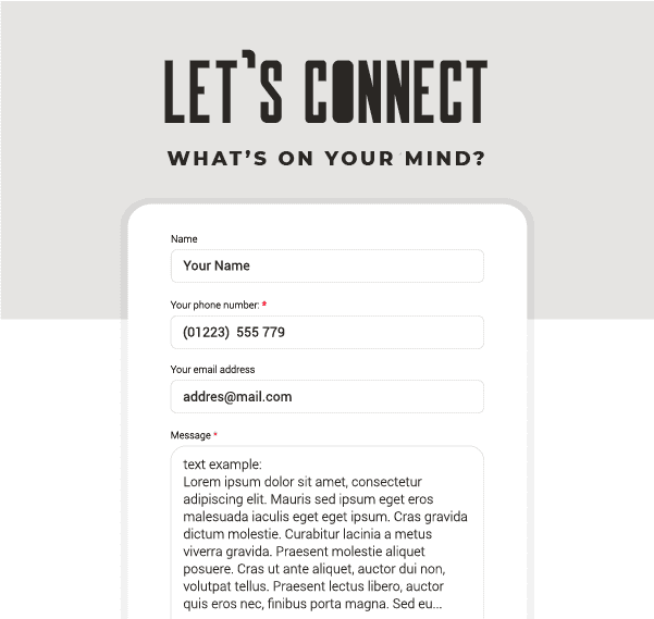
FORM BACKGROUND
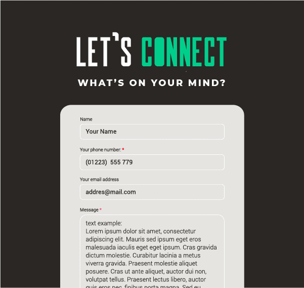
FORM BACKGROUND
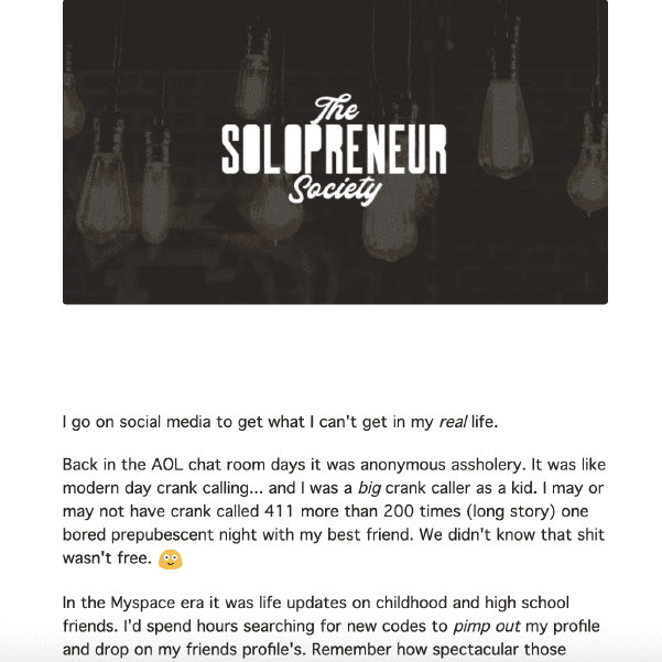
EMAIL body COPY + main BANNER image
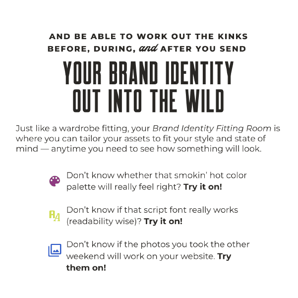
WEBSITE body COPY

background color for tldr section
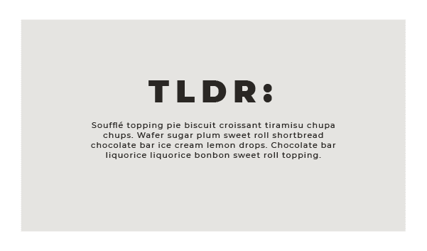
BACKGROUND COLOR FOR TLDR SECTION

BACKGROUND COLOR FOR quote

BACKGROUND COLOR FOR QUOTE

SECONDARY NAVIGATION MENU ITEMS

MAIN NAVIGATION MENU
Your accent colors are the colors you’re going to use to accentuate something special in your content, so you want the colors you choose to carry enough weight, in relation to your iconic and action colors, that they can stand on their own or in a “group setting”.
This is the style-purpose in your color palette where you can really have the most fun, even within the parameters of your happy place - just look around. Which pieces of your happy place do you want to pull from? The subtle pastels in the wall art? The retro colors in the floor tiles? The kaleidoscope of color coming from the incredible views?
Your accent colors can be totally different colors or shades and tints of the same base color. Let your happy place be your guide, and then style-proof it in your Brand Fitting Room for good measure!
Here are several ways you can hard-code your accent colors into your content…
Click any image tile below to eye-guzzle the full size image
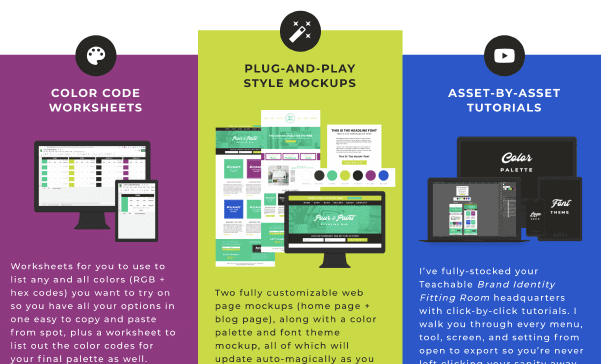
3-COLUMN SECTION
BACKGROUND COLORS
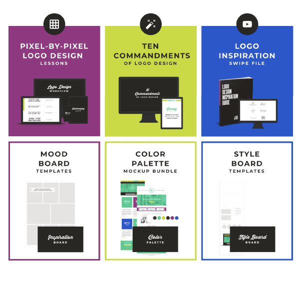
3-COLUMN SECTION
BORDER COLORS

BULLET POINTS IN YOUR CONTENT
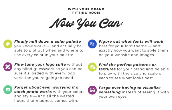
BULLET POINTS IN YOUR CONTENT

ICONOGRAPHY IN IMAGES

ICONOGRAPHY IN IMAGES
ASSIGN DIFFERENT ACCENT COLORS TO DIFFERENT TYPES OF CONTENT
ASSIGN DIFFERENT ACCENT COLORS TO DIFFERENT TYPES OF CONTENT

IMAGE TEMPLATES
IMAGE TEMPLATES
IMAGE TEMPLATES

IMAGE TEMPLATES
is how you can turn your brand color palette into an iconic piece of your entire brand!

I DOUBLE-DOG-DARE YOU TO...
To use this lesson to create a brand color palette that you can hard-code so deeply and consistently across your content that it becomes your silent (but unmistakable) calling card.
If you need help coming up with a smokin' hot, original AF color palette, or brand identity in general, that captures the spirit of your happy place, I got you, Boo!
Your branding survival kit is packed and ready for pickup...
when it comes to creating a
BRAND IDENTITY
you've gotta come prepared!

say hello to your
BRANDING bug out bag
Your very own branding survival kit, fully stocked with everything you need to create a handcrafted brand identity that's as original as a fingerprint and addictive as a two for one happy hour, so you have peace of mind knowing that the only buzz you're creating is the kind that's contagious.